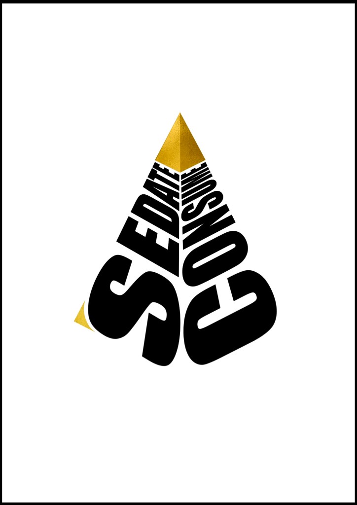
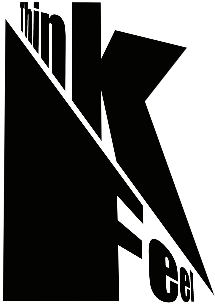
Prompt given 12/10/20, completed 15/10/20. I was said to make an A3 poster of whatever we wanted. Instead of doing an ad, I decided to put up a message, especially of contrasting or complementary concepts. Lately i have been very inspired by Russian constructivist posters and the way they incorporate perspective in typography. These were my first three concepts

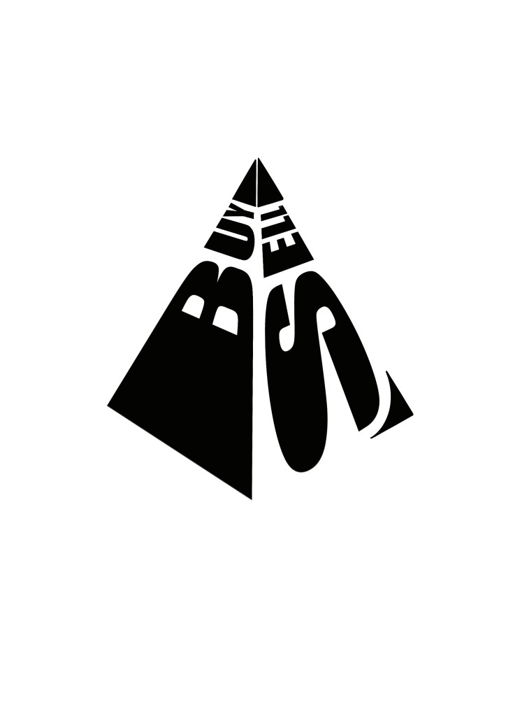
I decided to go for the third concept but I felt that the message was a bit weak. Also i wanted to break the monochrome in some way. I decided to incorporate the second message onto the third concept and make the top of the pyramid gold. This is the final result.