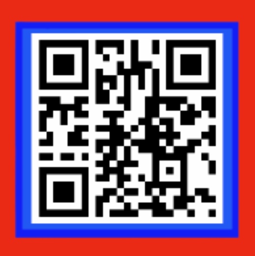
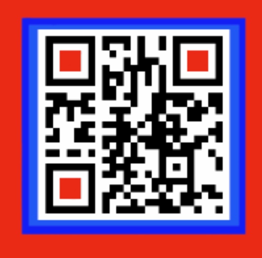
Prompt given 5/10/2020, project finished 1/11/2020. We were told to do a A1 poster to promote ourselves. First thing I thought is that I don’t really care that much about me, as a person and as an image; I give more importance to my actual work. I believe that my work should speak for me and transmit who I am without my name even appearing in it. So the first idea I had was to lure the random stroller right into the poster, nothing subtle but at the same time non intrusive and visually appealing. This was my first draft.

I wanted to direct visually the attention of the beholder to the QR code.
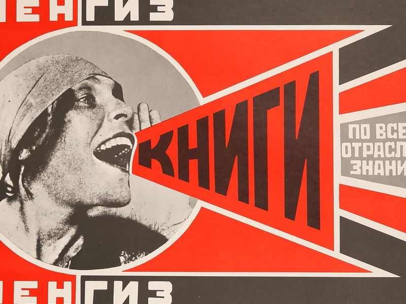
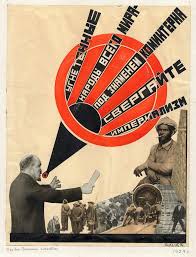
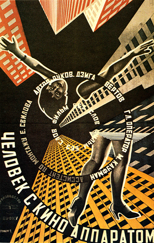
I continued to explore the possibility of the Russian constructivist influence, using perspective in typography and creating spaces with it (for more information check my last post). These are some examples of my references
From left to right: “Books (please)” – Alexandr Rodchenko; Unknown; “Man with a movie camera” – Alexandr Rodchenko.
This made me expand as much as I could the possibilities of perspective and the impact it can have, I ended up making this prototype:
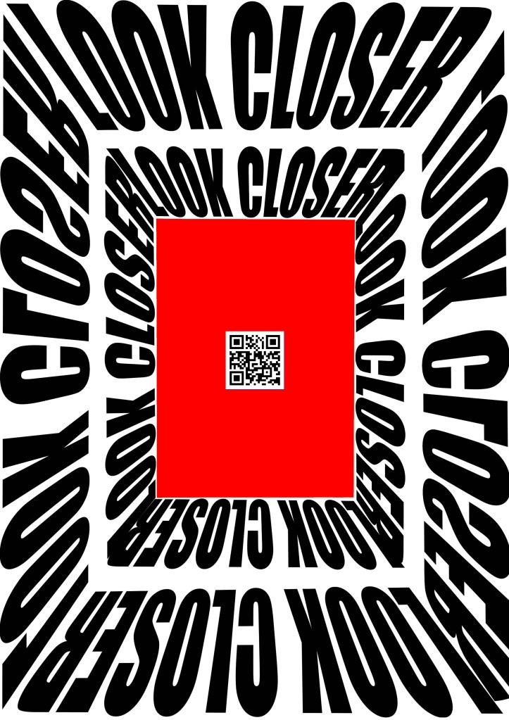
I will elaborate more on this idea but first i want to show the rest of the options I pondered. Some more serious or elaborate than others but nonetheless things that I may recycle in a future.
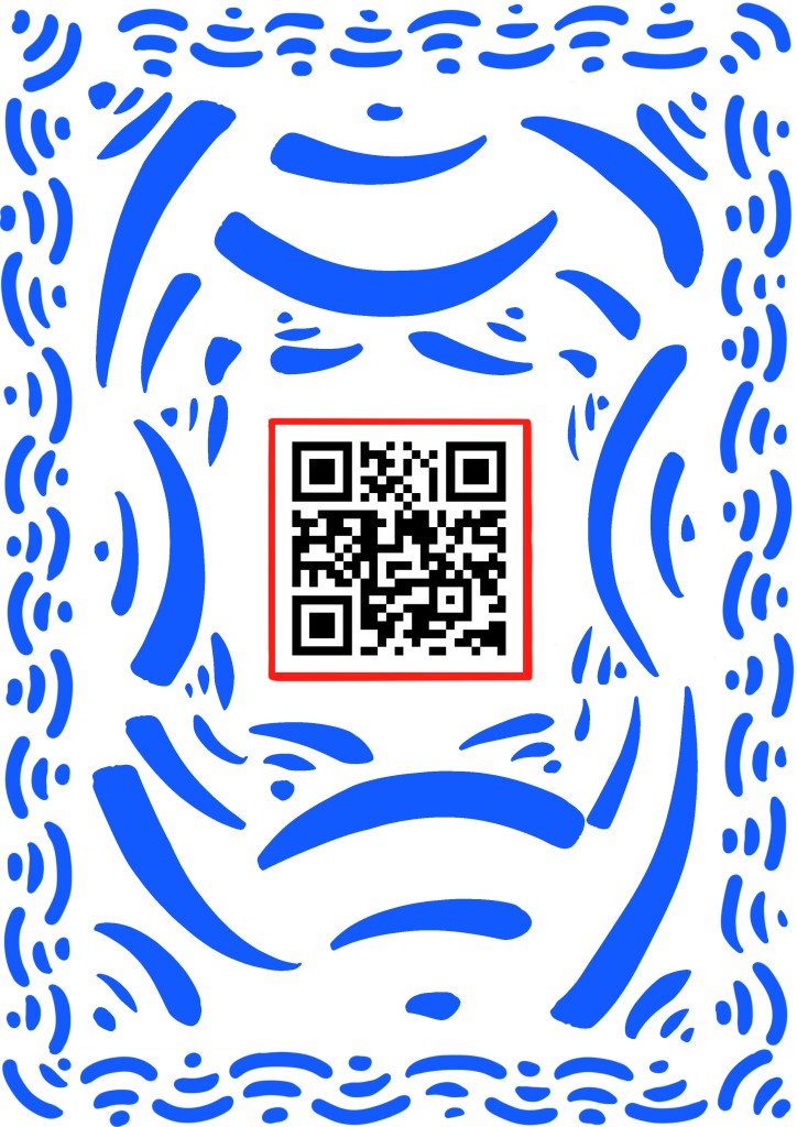
- 1: Played with mediterranean ceramic motifs around the QR code.
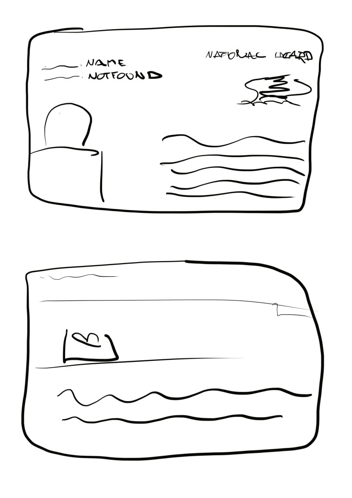
- 2: I thought on putting myself in an ID (playing with the artistic name of “namenotfound”)
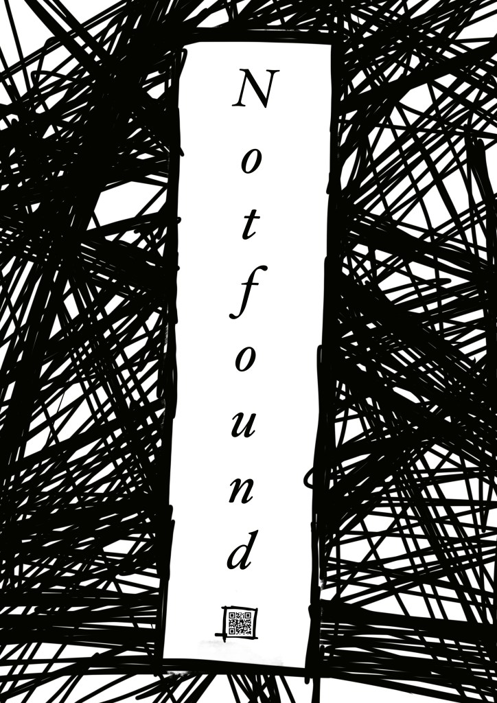
- 3: I mixed very messy and agressive lines with serif typography to create contrast, something that i might explore more in the future.
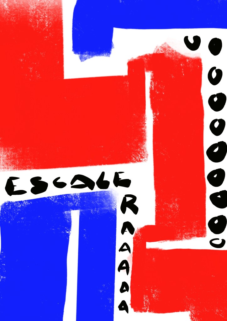
- 4: I improvised with forms to create passageways where words could walk around.
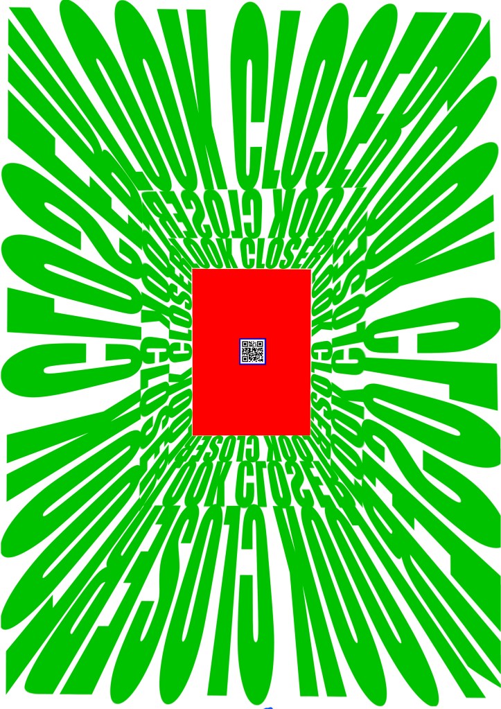
My fifth option was more of an evolution of the idea that I ended up pursuing:

I researched optical illusions by suggestion of a friend because of their mesmerising character. I decided to add a reverse message to distort the image and it somehow worked in drawing more attention.
I also used the golden ratio to figure out the proportions of the poster, something that I find myself using more and more. This was my process on this matter.
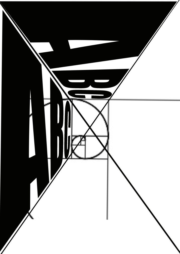
I used the Fibonacci sequence to decide the dimensions of the red square —I decided to do it smaller because it’s an A1– and of the QR code.
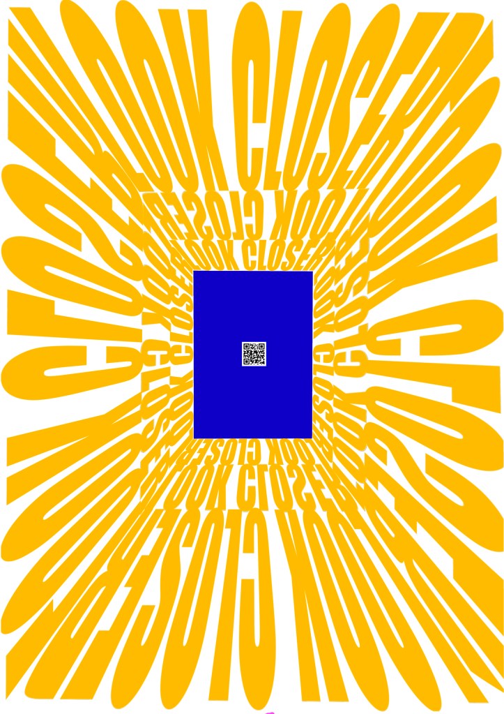
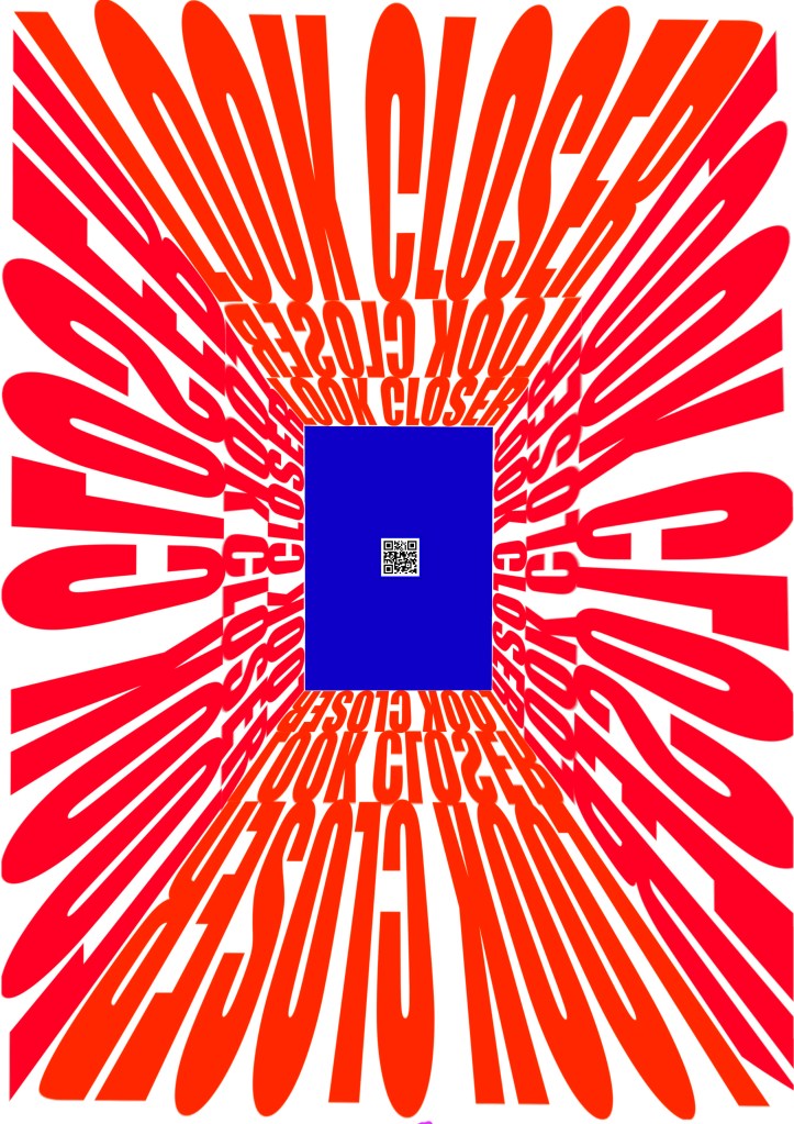
I also experimented with color, my first idea (and the one that I ended up sticking to) was to use a white background, black lettering and a red rectangle. By suggestion of my teacher I experimented with complementary colors to make it even crazier. These are the results.
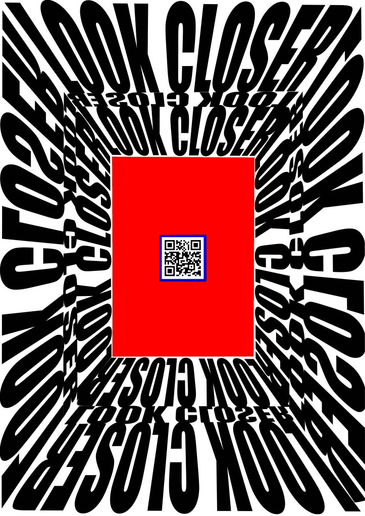
These are, although fun and attractive, obviously very hard to look at. But I did learn something of value. I saw that if I put a subtle blue outline on the QR code it makes it pop up, very slightly and almost unconsciously but it helps to make it more attractive.
In regards to the form the changes are very slight but truly important. The first big change I made (figure 2) was to add the message in reverse between the two bars of ‘look closer’, to create the optical illusion. Then I decided to make that bar bigger and add more perspective and depth (figure 3). Finally, as I mentioned before, I made the red square smaller.
Finally I decided to change up the typography. I had been using ‘impact’ in my previous projects and I wanted to change up a bit. I asked my teacher for suggestions and I found ‘Industria’
I decided to use Industria because of the horizontal and vertical lines that are present on the characters. I feel like they add more sense of space and are less intrusive; also it has some curved lines that makes the image quite unique. I also lowered the kerning (space between letters) to not leave as many white spaces, again a subtle change but with a lot of importance in the final outcome.
I also researched some changes I could add to the QR code to make it a bit different. I just decided to add some color and it does look interesting but I felt like there were enough elements already to add something else. Sometimes less is more
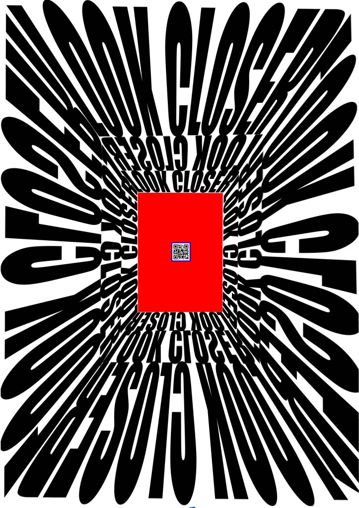
Then I went on to decide what I wanted to show in the QR code. I considered to add a link to my Instagram, this website or to a specific piece of work. I felt like if I was walking down the street, saw the poster, was interested, scanned it and found a website I would be rather disappointed. I also don’t have a big body of work (yet). So I decided, for now, to add a link to the song I made: ”Bedsheets and Nightlights” (check the last entries on my blog); I say ‘for now’ because I feel like this poster has the strength and impact to be used as an ad for a future exhibition, concert, performance or something around those lines. Anyways, here is the final result:
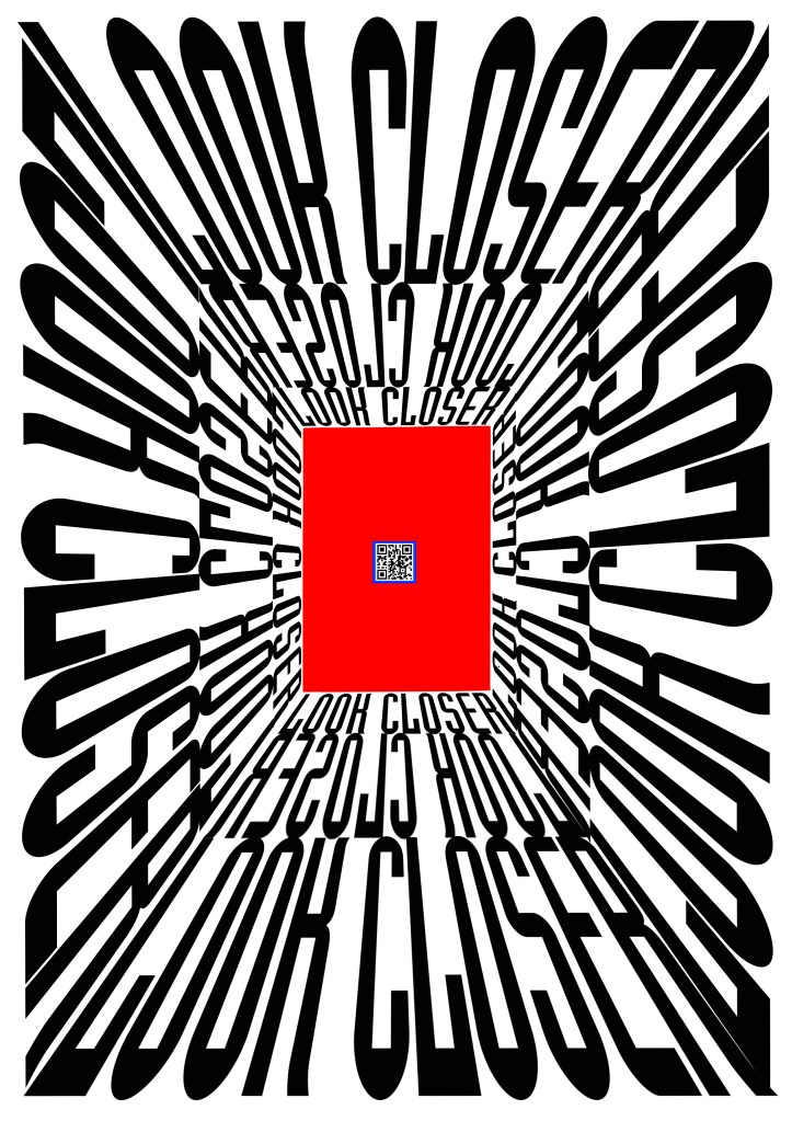
The first thing that my teacher said when they gave us the prompt was to “make something you would hang on your bedroom wall”. I think that as simple as that advise might sound it’s actually a great way to measure if what you’ve done is good enough. With that said I would never hang this on my bedroom wall because everytime I woke up my eyes would feel attacked by the vortex of typography and contrast, but I would be more than glad to see it on the street or perhaps in my living room. I am truly satisfied with the result and I hope that you, reader, feel more inspired through my work. Thank you for reading
