Prompt given on 4/1/21, finished on 28/01/21.
This was the third project set for us for Visual Narratives and Design Thinking, meant to give us a taste of what a Design Marketing project would be. The brief was:
Create a campaign based on the theme of reclaiming a 4 day working week – the advantages to a healthier lifestyle and a better balance between work and downtime.
– Ideation – research and develop ideas
– Design a brand with logo in, create the values of the brand
– Create an interactive promotional piece (using Adobe After Effects)
– Develop a marketing plan for a sustained delivery and roll out over different media platforms and deliver the website home page.
So my tasks were, apart from creating this blogpost, to figure out the theory behind a 4-day working week and make it a commercially viable idea, design a logo, animate the logo, make an ad, develop a marketing plan and put it all together on a PDF. This was definitely the hardest project they had set up until now.
WHAT IS A 4-DAY WORKWEEK?
It’s a new business model that has begun to be implemented in the last 30 years: it consists on working 4 days a week and resting three. There are different variations on this scheme. Having the average amount of working hours per week in the EU as 37 (7.4 per day) we can:
- Either maintain the 37 hours and work 9.25 per day (compressed)
- Or cut the 37 hours and work 29.6 hours per week, thus maintaining the 7.4h working day.
The first method has proven to be counter productive, as workers become exhausted by working nearly 2h more per day. However, the second version (possible thanks to automation in the workplace and technological advancements, allowing the employees to work less hours) shows that it doesn’t only maintain the income of the business but it can also increment it. It also produces an increase in motivation and productivity in workers, apart from a reduction of stress.
Many major businesses like Microsoft Japan, Perpetual Guardian, Shake Shak, Think Productive or MLR Recruitment have adopted this business model with astounding results. In Microsoft Japan, for example, Nine in ten employees said they preferred the shorter working week. And there were some additional side benefits too, including a 23% reduction in weekly electricity use in the office and a 59% decrease in the number of pages printed by employees. Also, productivity jumped 40%, meetings were more efficient and workers took less time off.
But there can be disadvantages, as shown in Sweden when they implemented a 4-day working week to their nurses, since they ended up working more hours than they did before. This was due to a lack of the right technology, support and workspace culture.
With all this information, I started thinking who, hypothetically, would advertise this idea. Our teachers told us that it would be more of a social movement than anything else, but also gave us freedom to do whatever we felt like in that field. Since the market audience is essentially centered on the wellness and productivity of employees and also the profit of a business, I thought of making this a business too. It would be a consulting agency that would help businesses transition into a 4-day workweek. Tailoring this new way of working to fit the needs of the business so that productivity and satiscaftion in employees goes up and profit doesn’t go down.
Also the identity of this agency would have to be sleek, professional, modern and for the help of businesses and employees. It wouldn’t say that the current way of working is bad but that what it offers can be better.
LOGO DESIGN
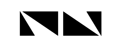
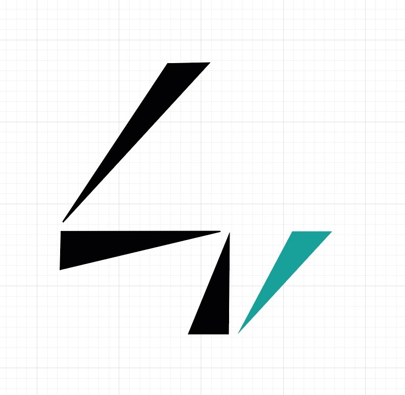
Once finished with all the theory and seeing it was a viable option, I started designing the logo. I was very inspired with the Paula Scher episode of Abstract (a netflix show) and inmediately started drawing, trying to reduce basic shapes to triangles. Specially the number 4. These are some of the sketches and notes i made throught the whole project:
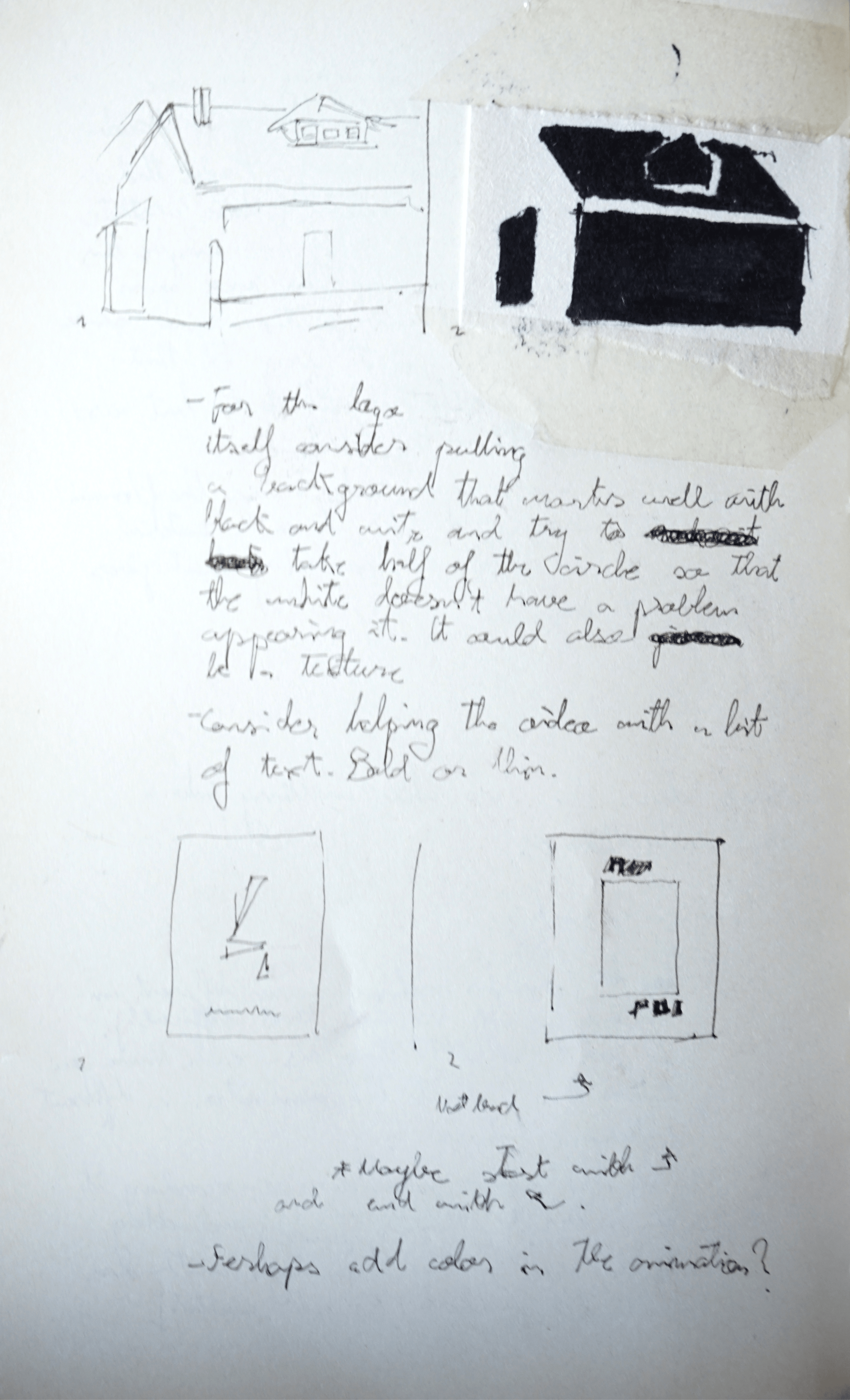
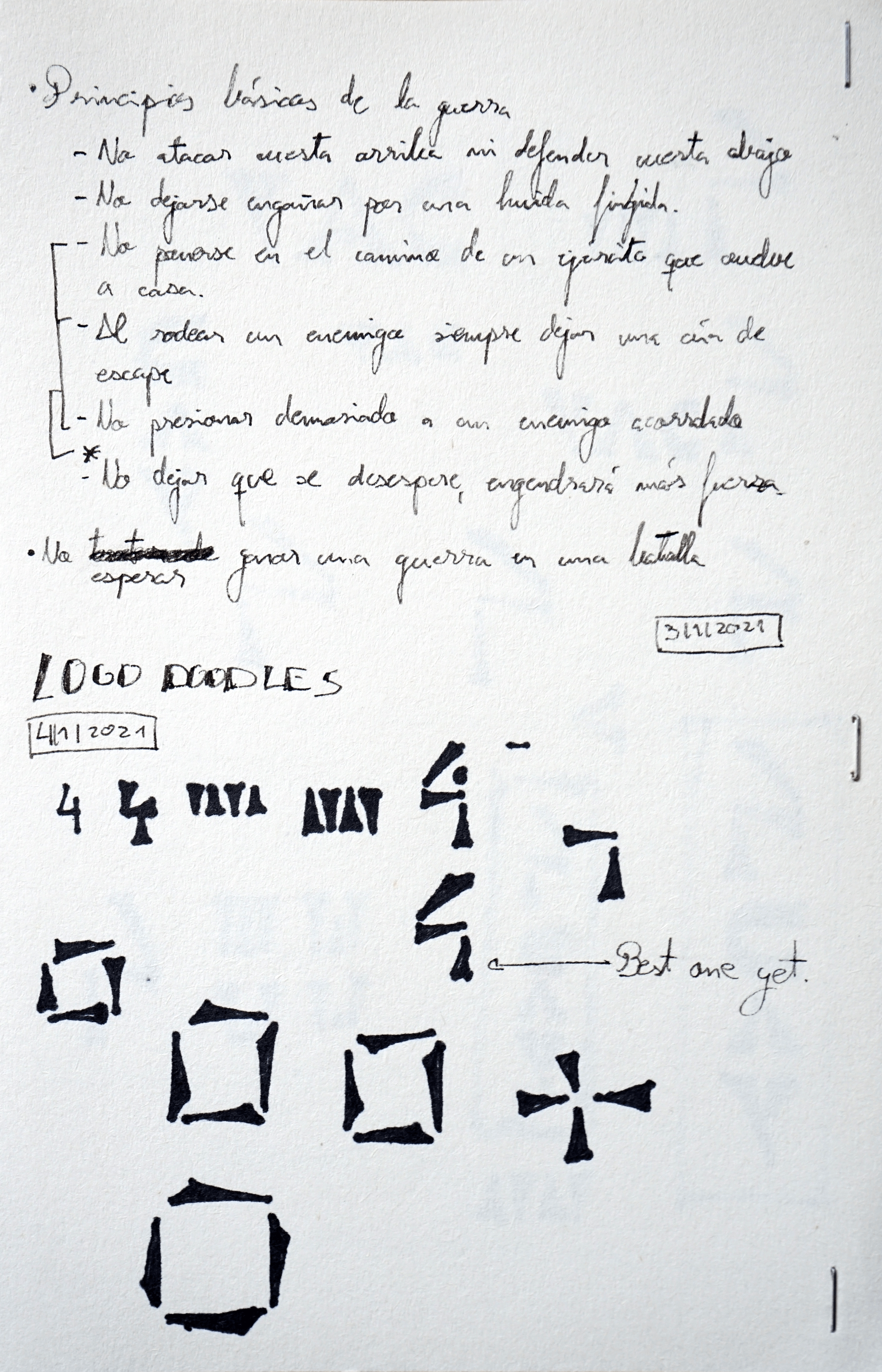
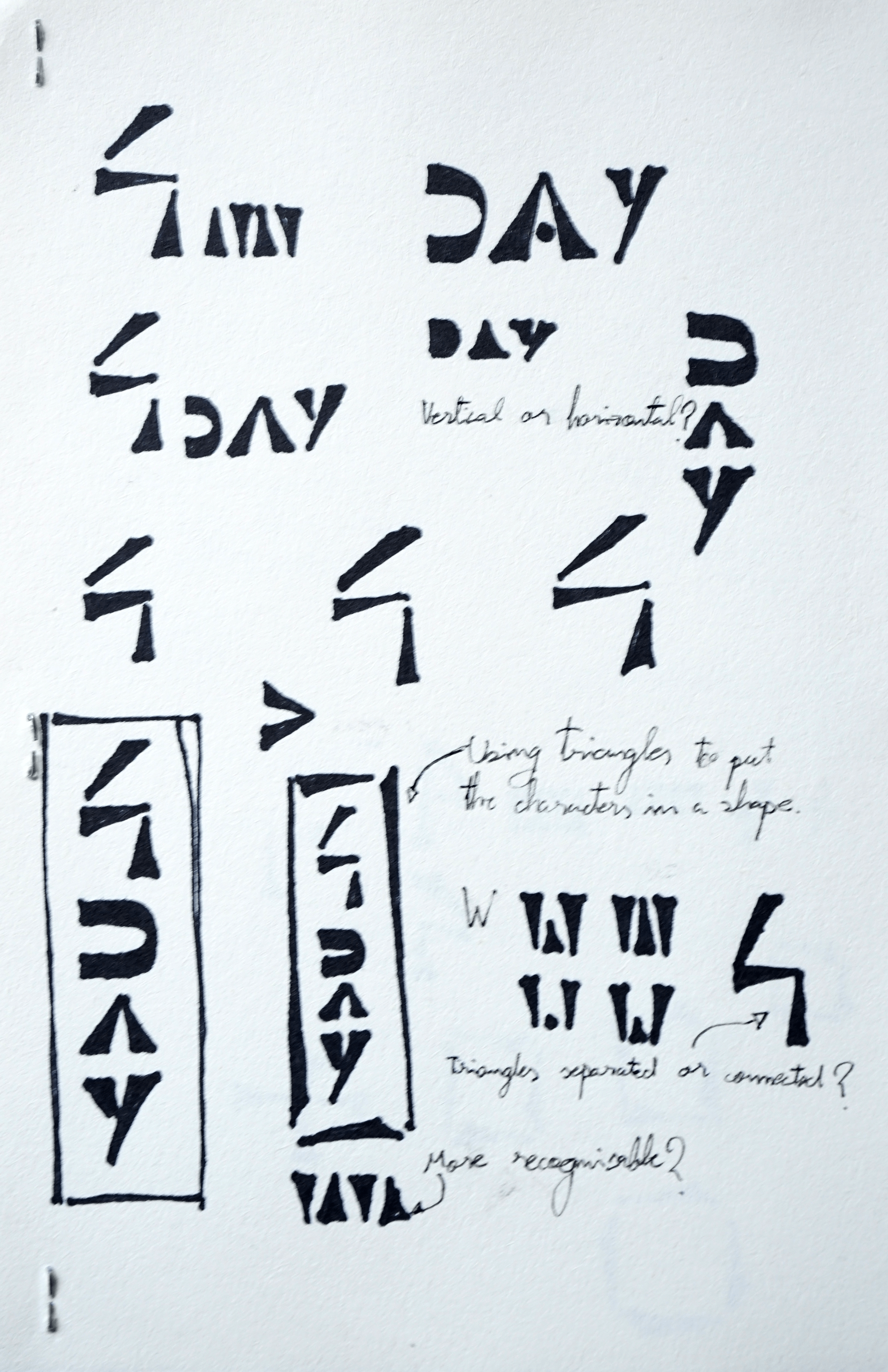
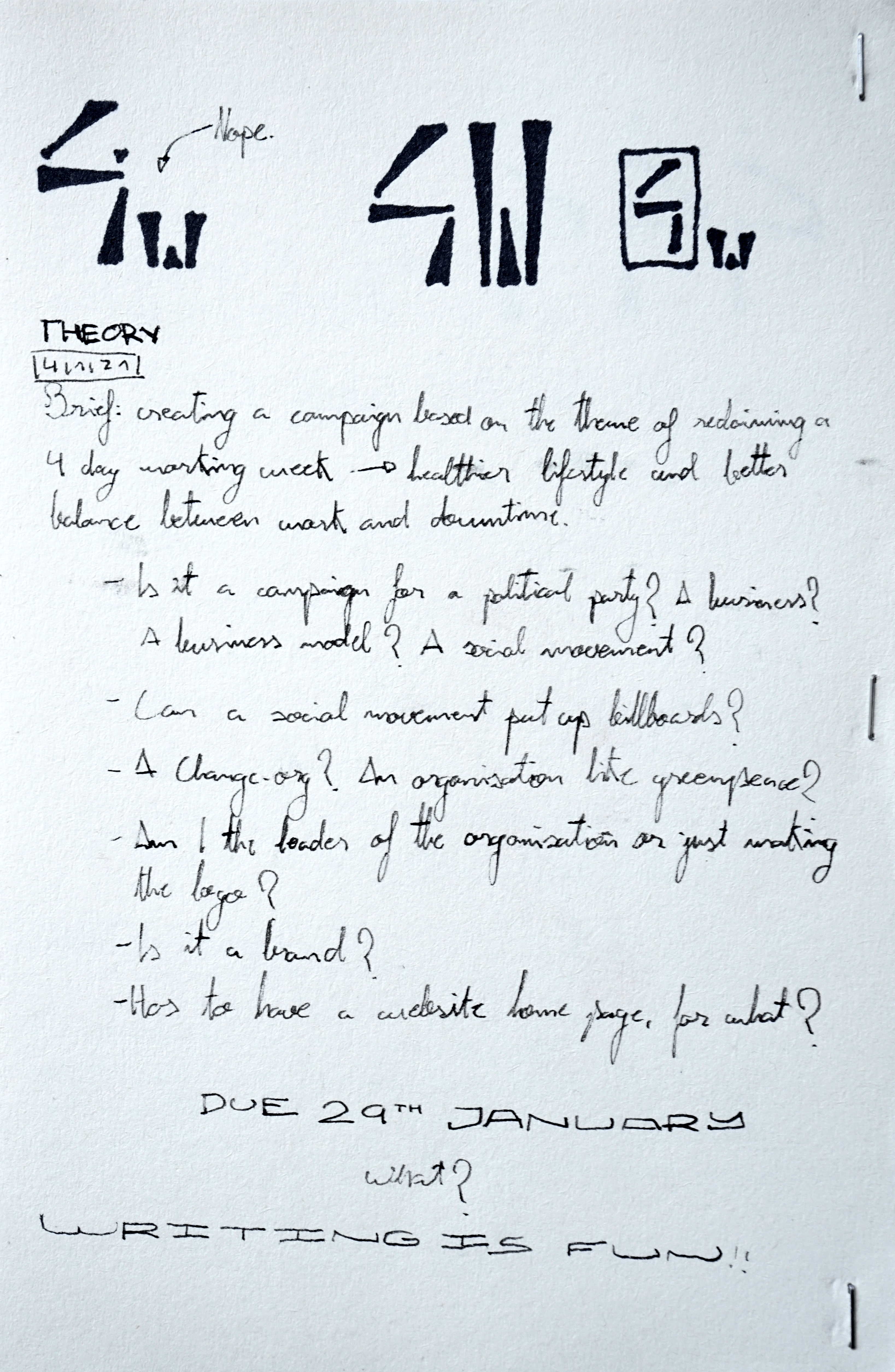
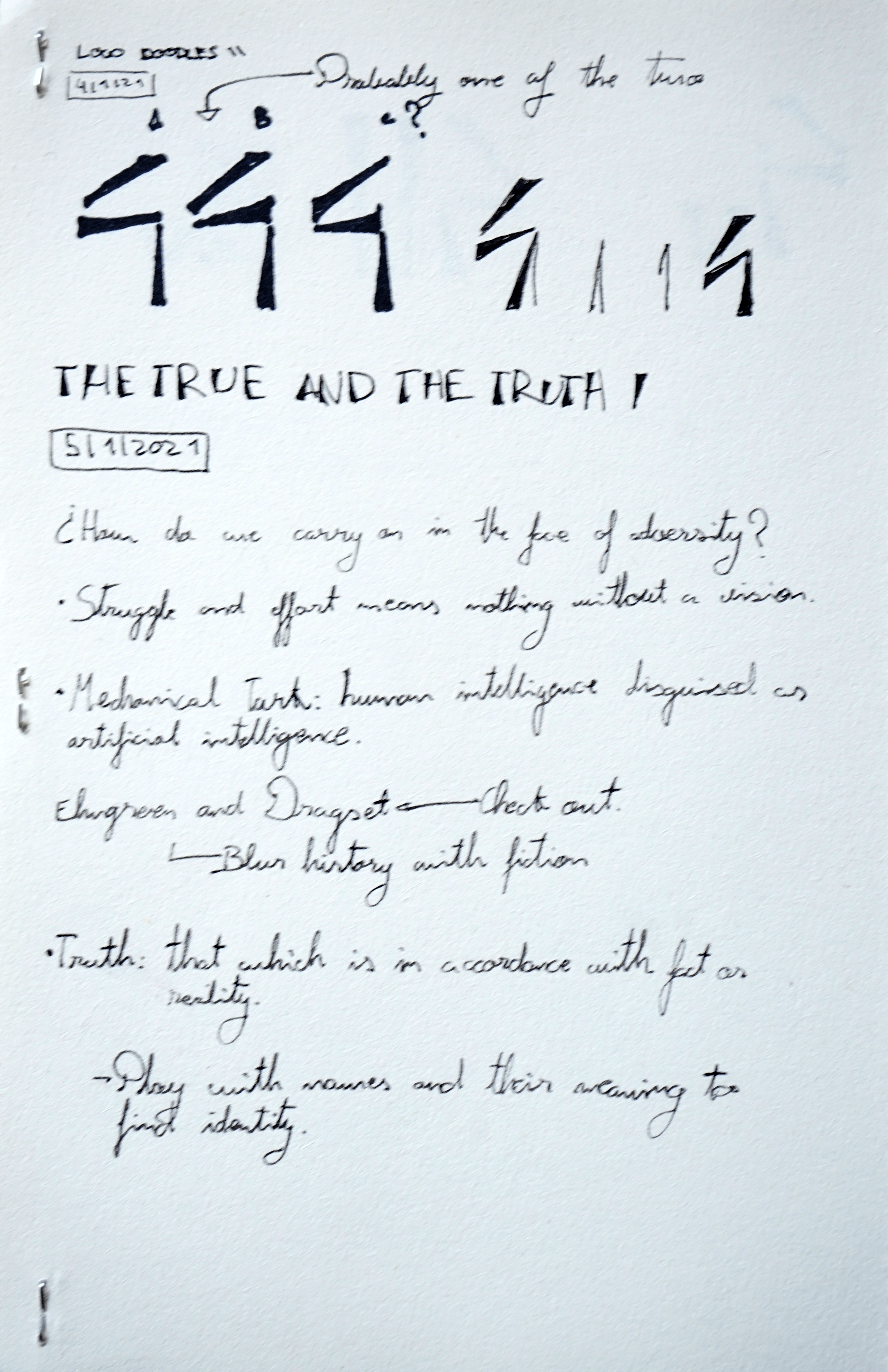
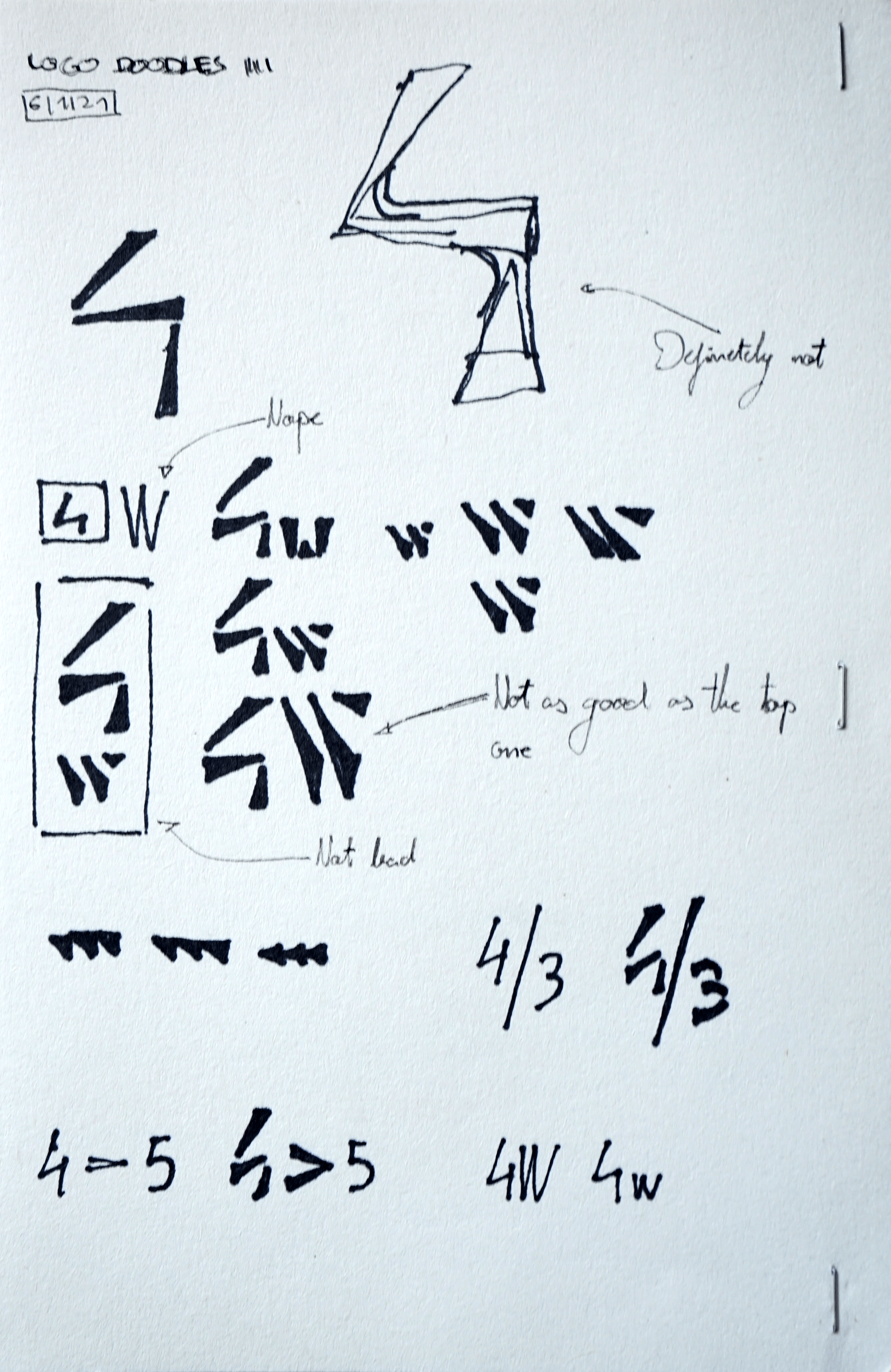
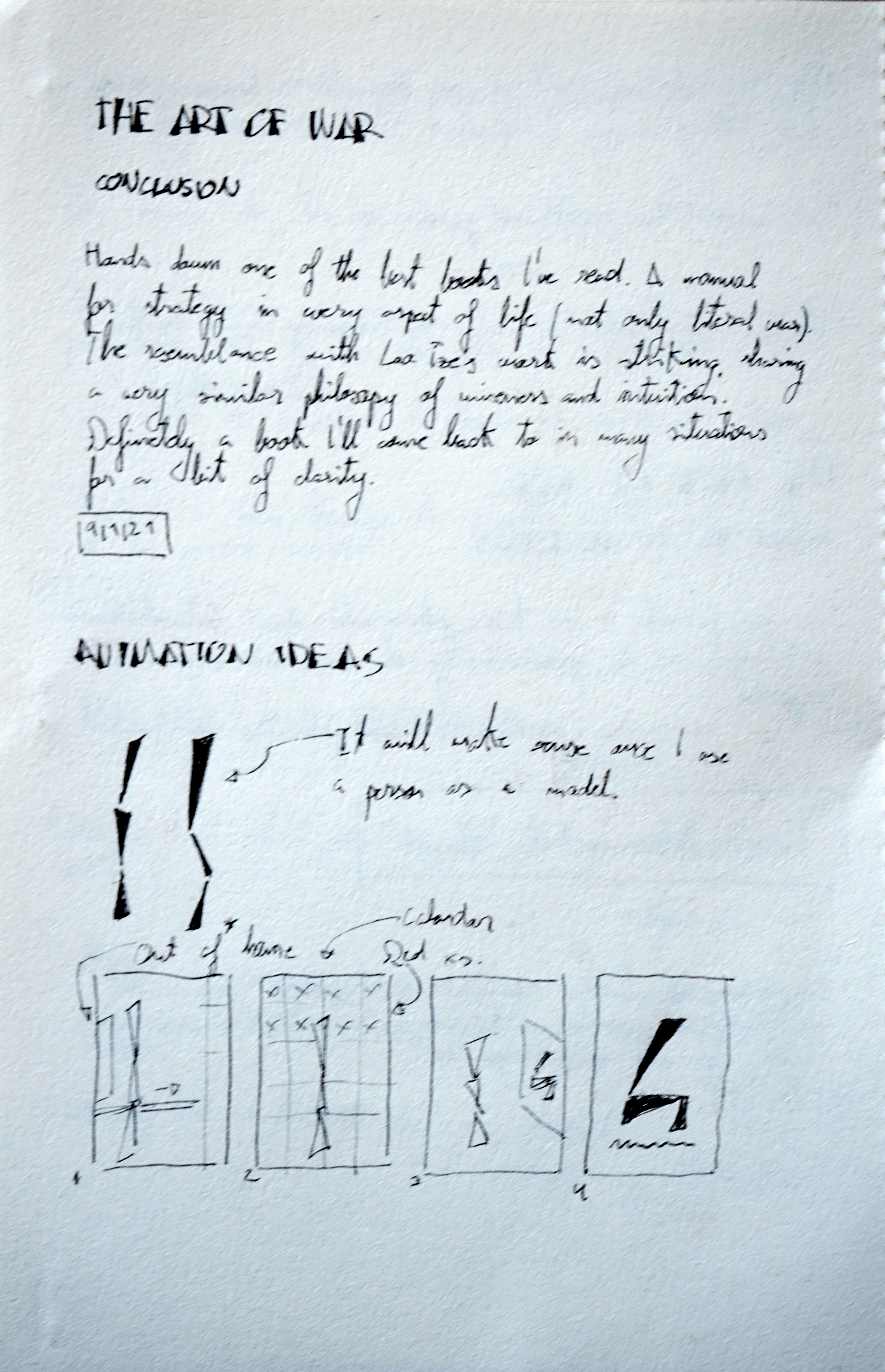
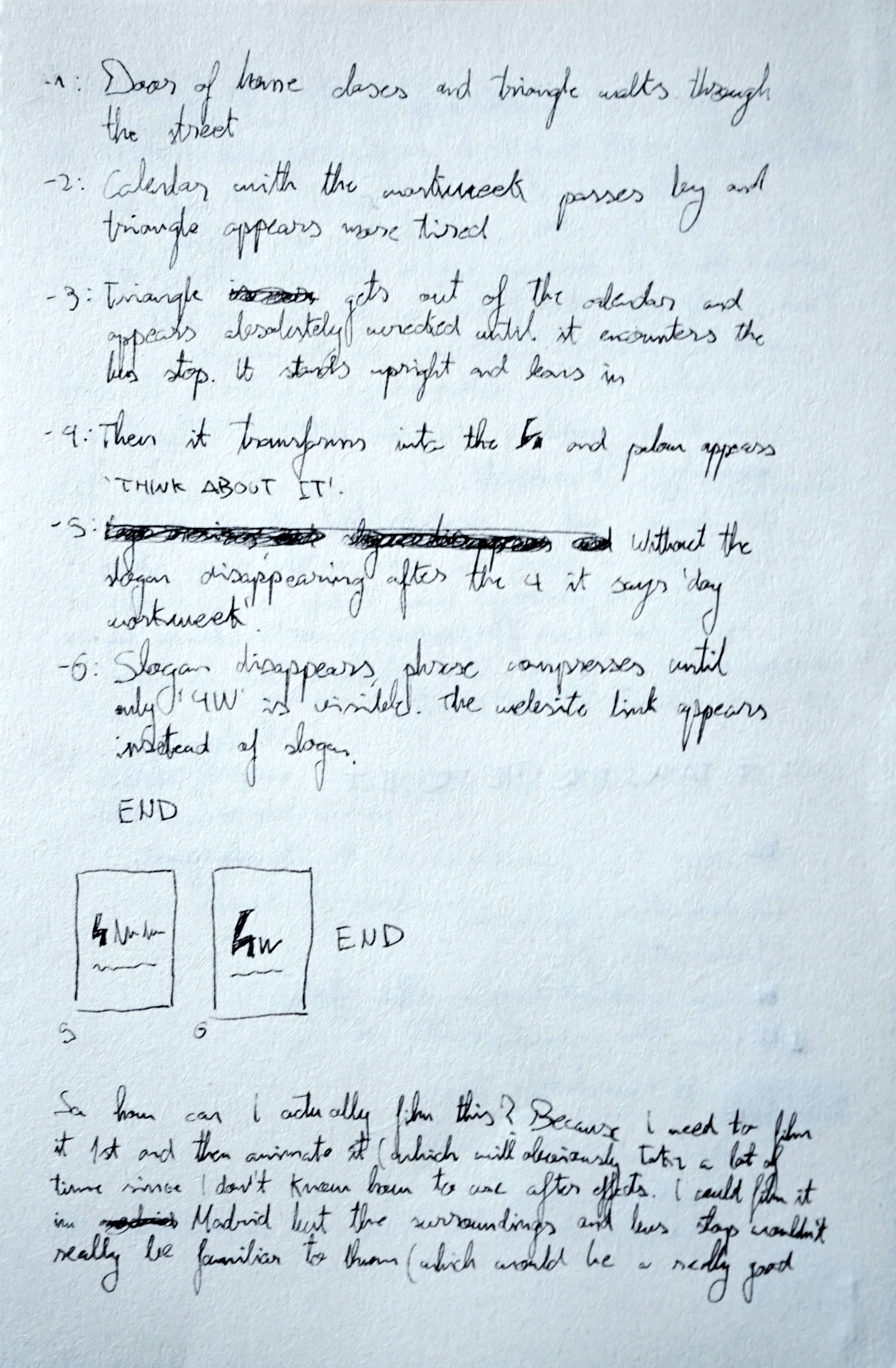
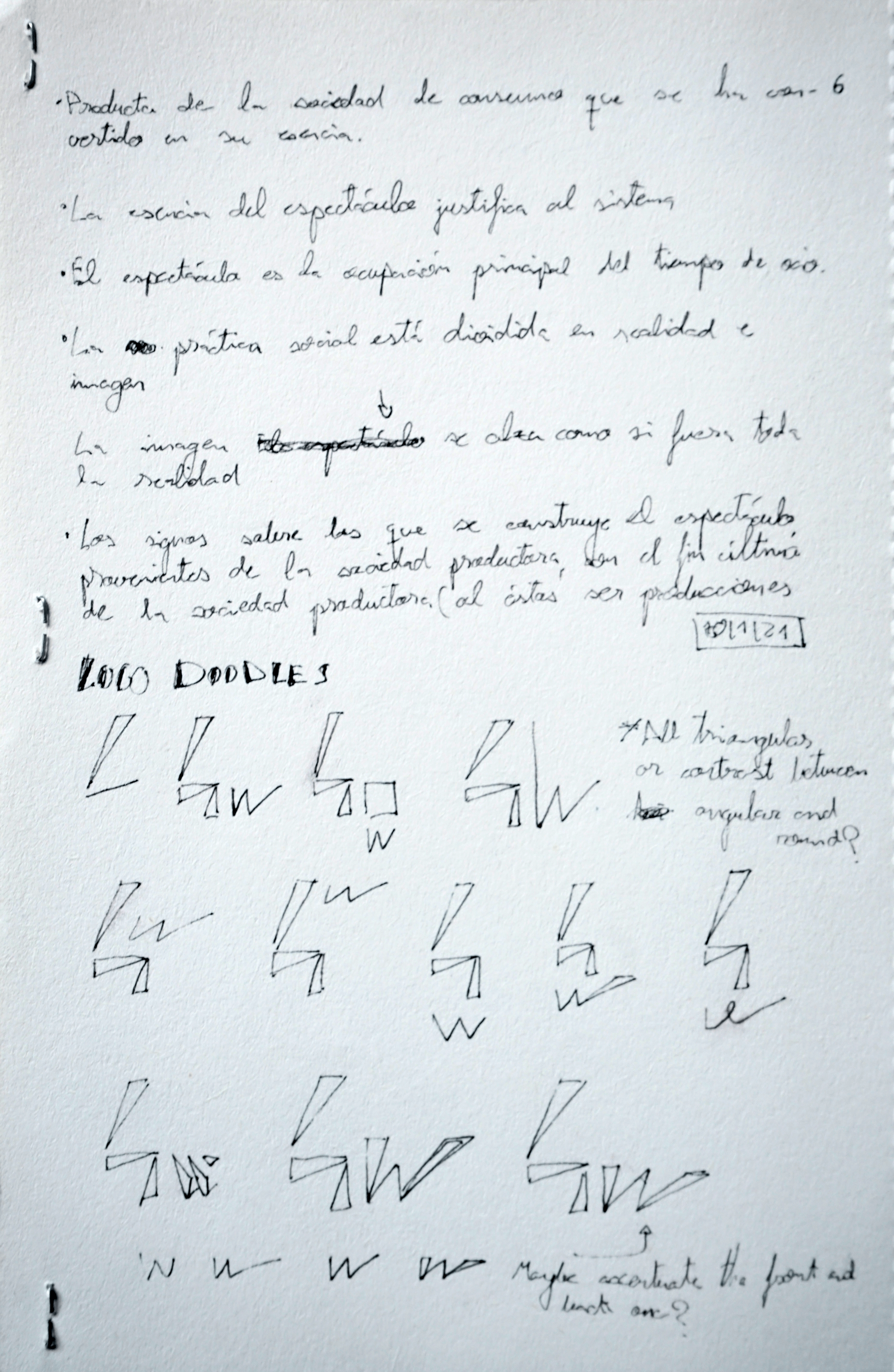
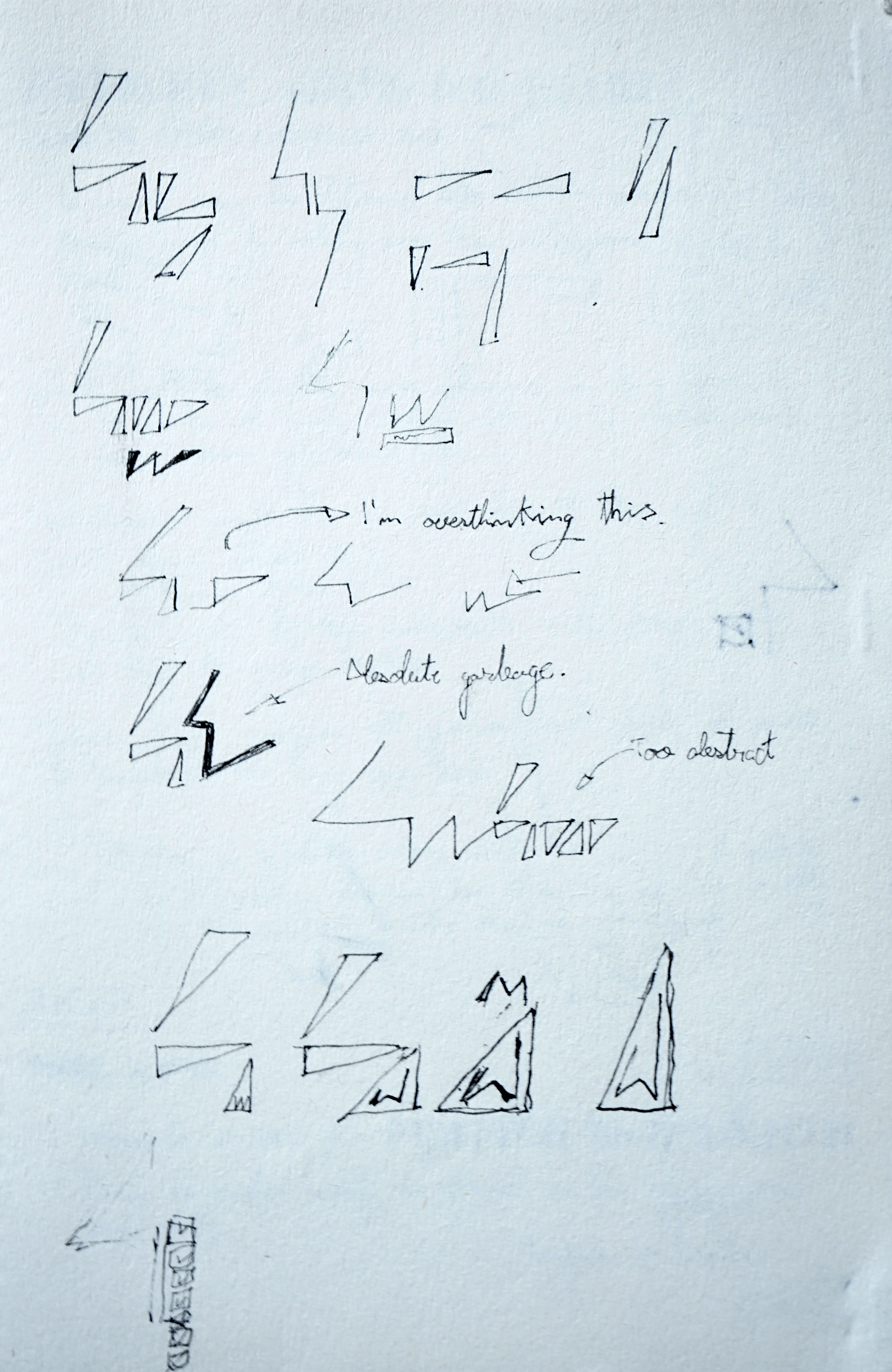
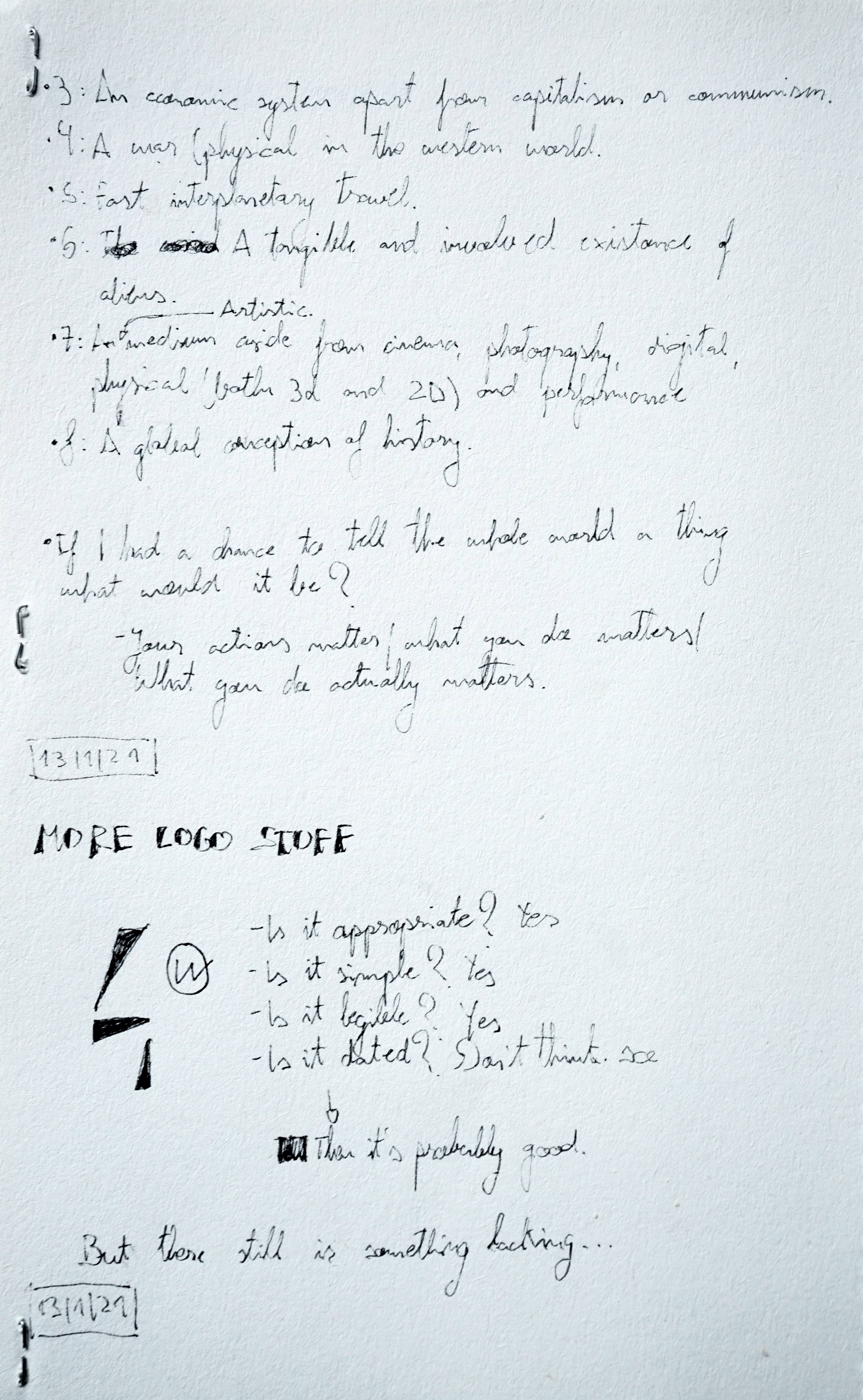
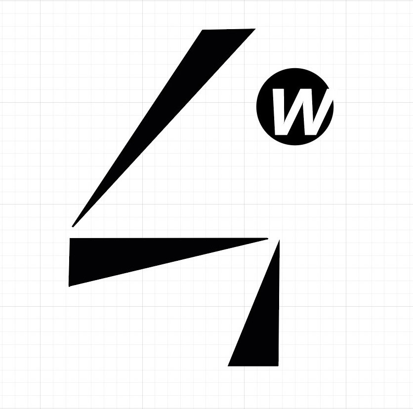
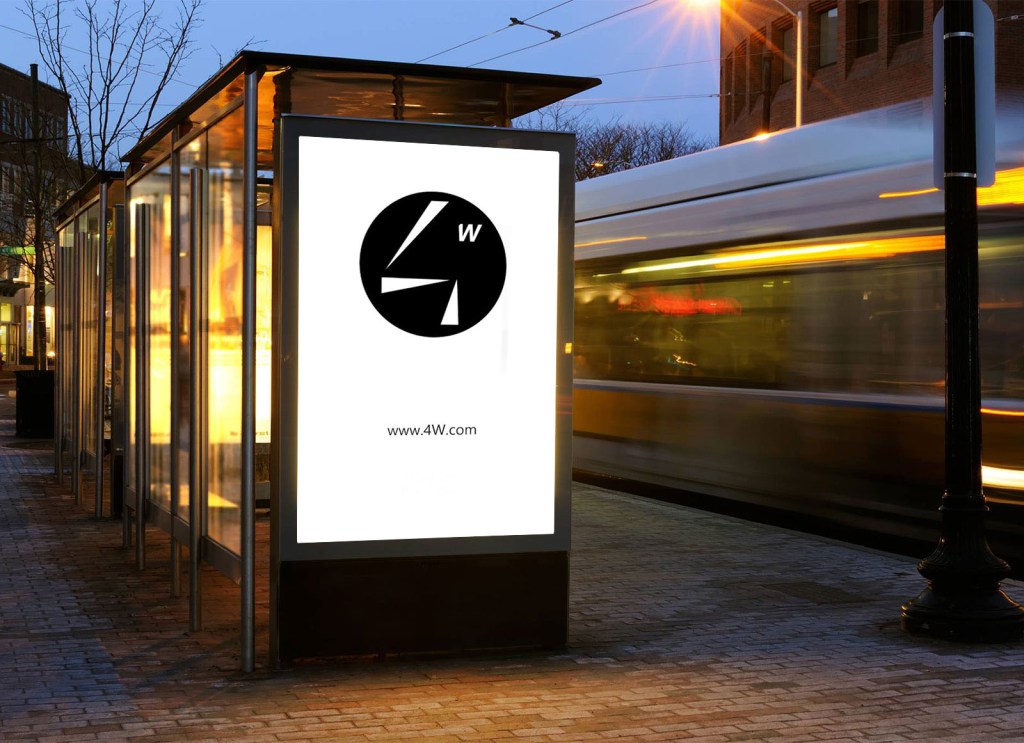
I thought that a good brand name could be 4W, being very self-explanatory and easy to remember.
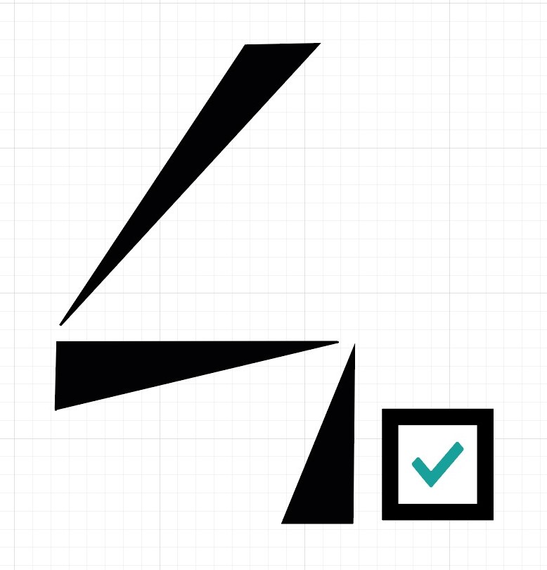
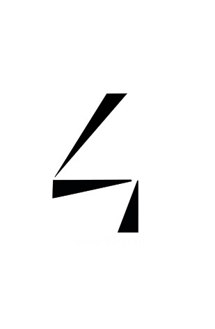
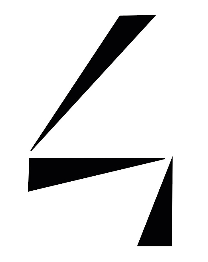
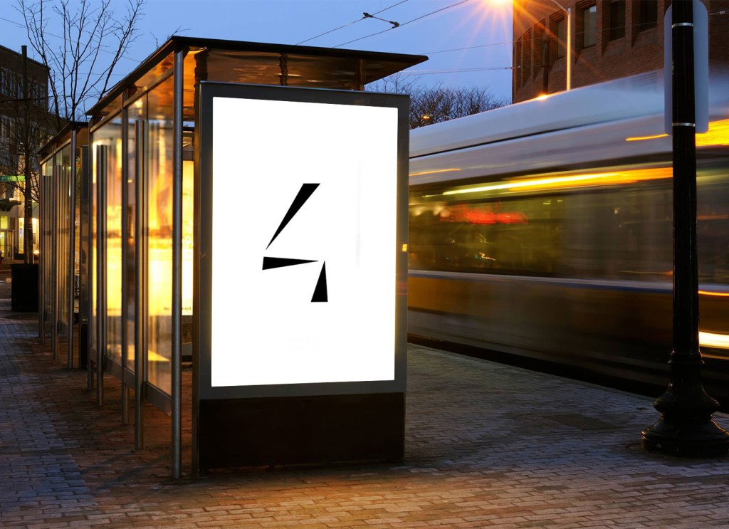
I noticed that the main object of all my sketches was the four made out of triangles, and since I hadn’t used illustrator before I challenged myself to make it in digital.
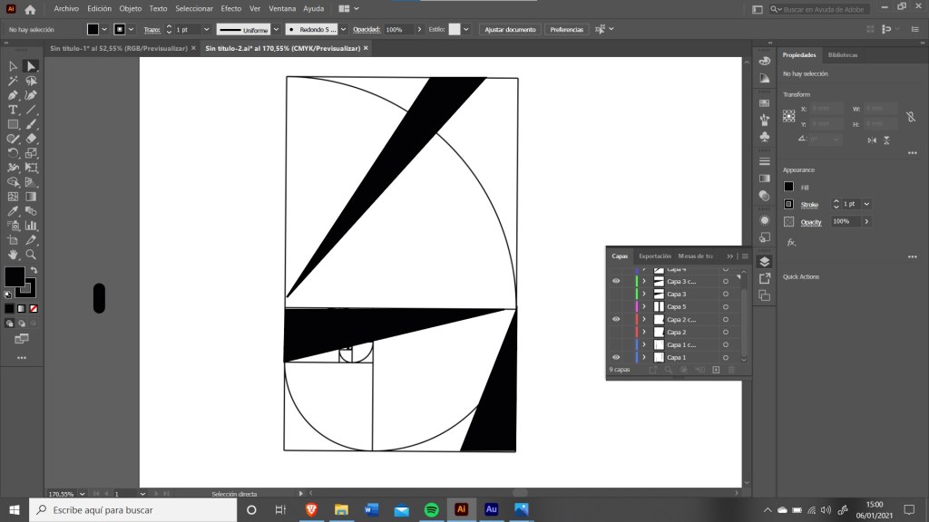
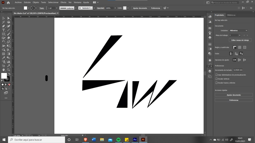
I used, once again, the fibonacci sequence to figure out the proportions and I was extremely happy with the results. The problem is that ev erything that I added seemed to be secondary, the four had too much protagonism but I wanted to add the ‘W’ somewhere. These are some more concepts from illustrator.
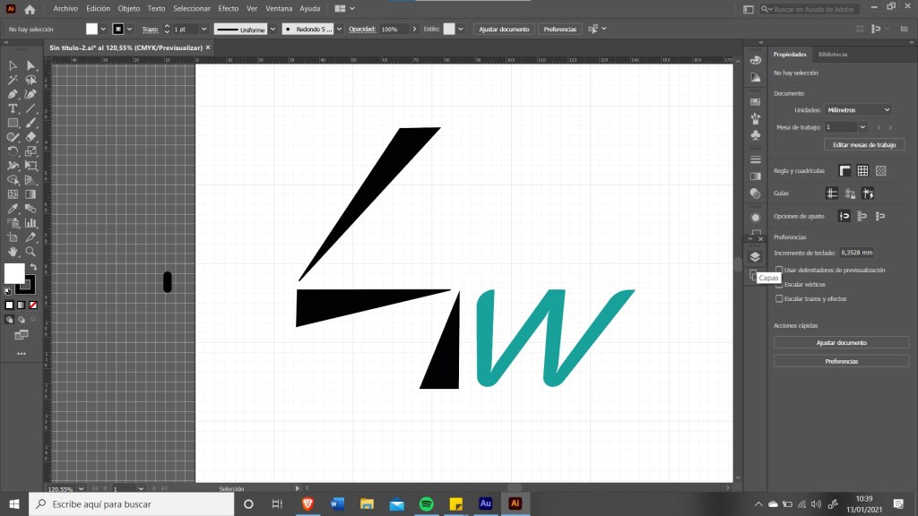
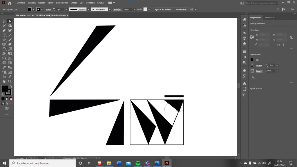
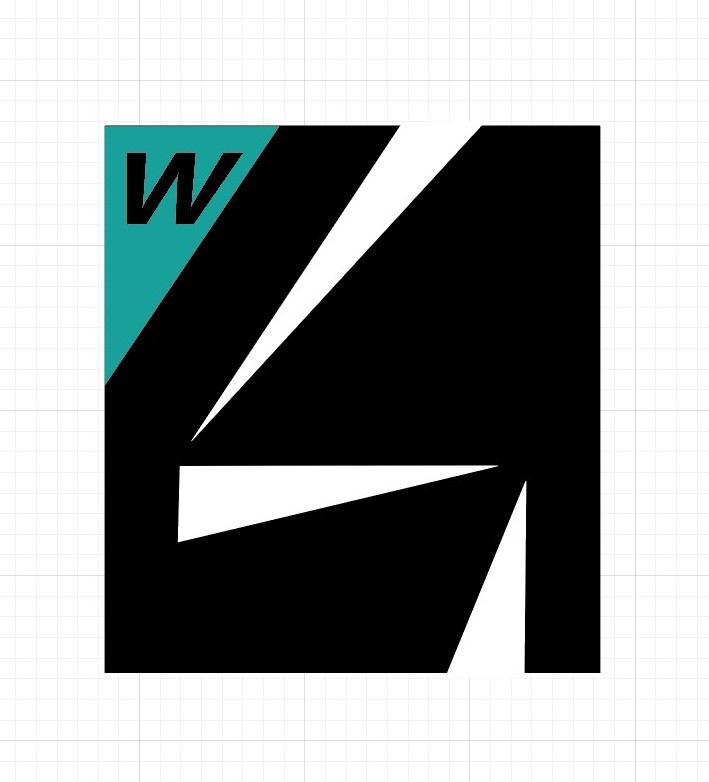
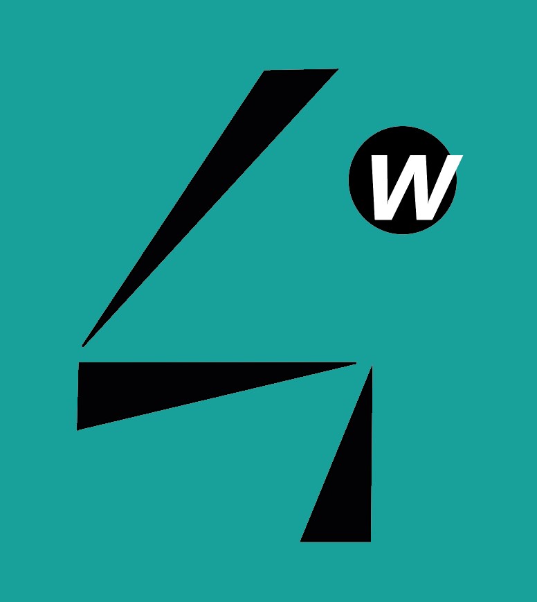
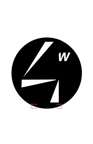
I really liked some of these concepts, like the top right one, but it just wasn’t appropriate for the idea I had in mind (looks too agressive, good for a clothing brand) and in a class feedback session they suggested me to go for the bottom right one but rounding up some edges, so this is what I came up with.
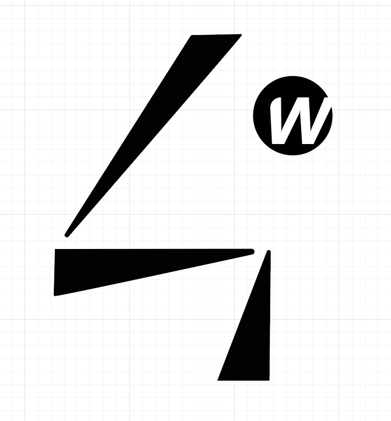
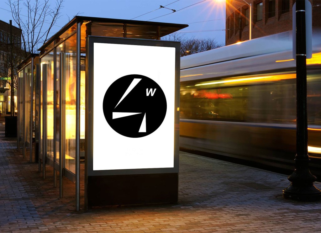
I considered this to be my final logo for a week (even though i was not 100% happy). I even made the animation for it, which I will show in the next section, and when I was revising the frame for errors I found, by accident, what I now consider my final logo.
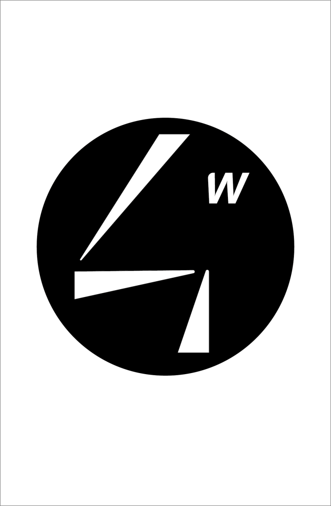
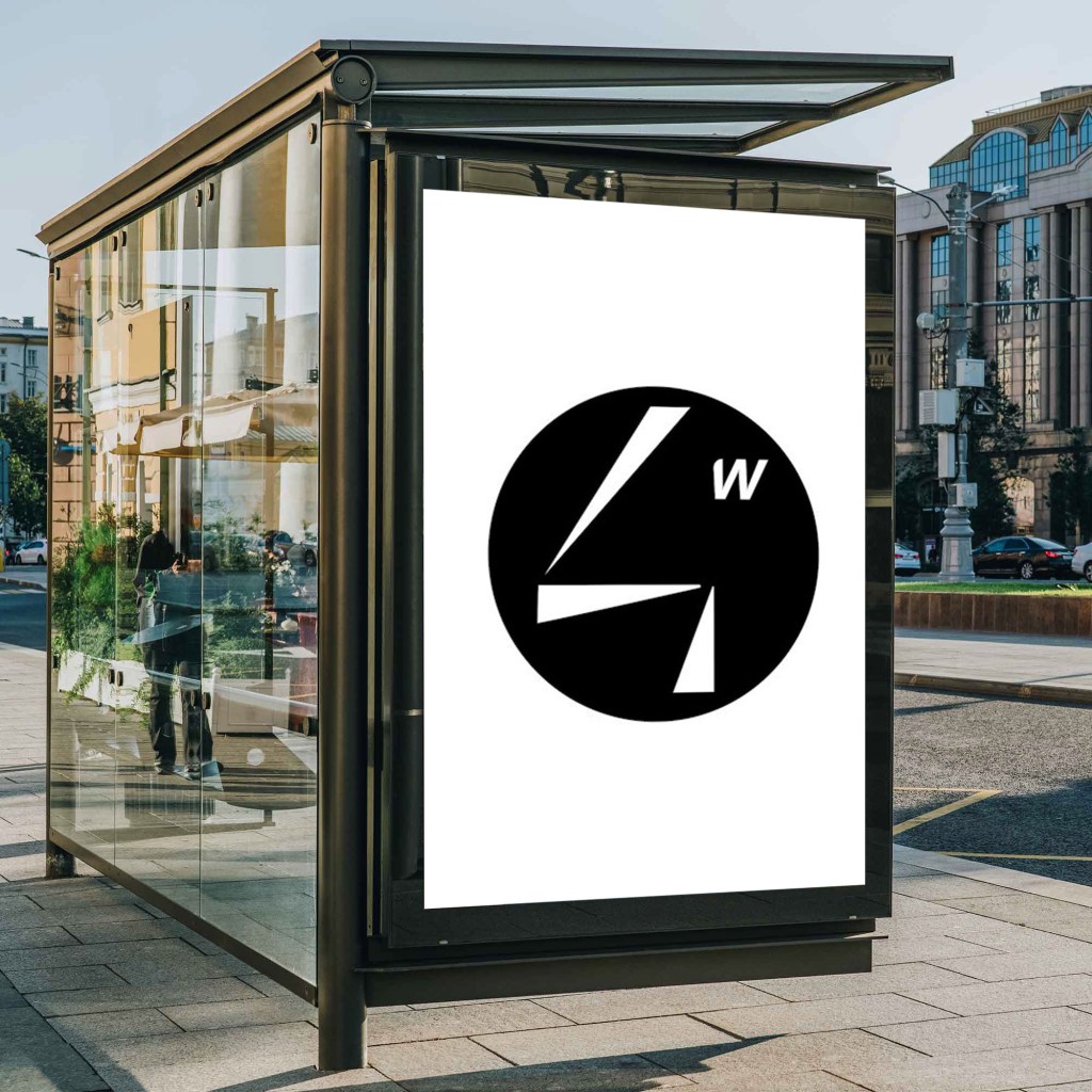
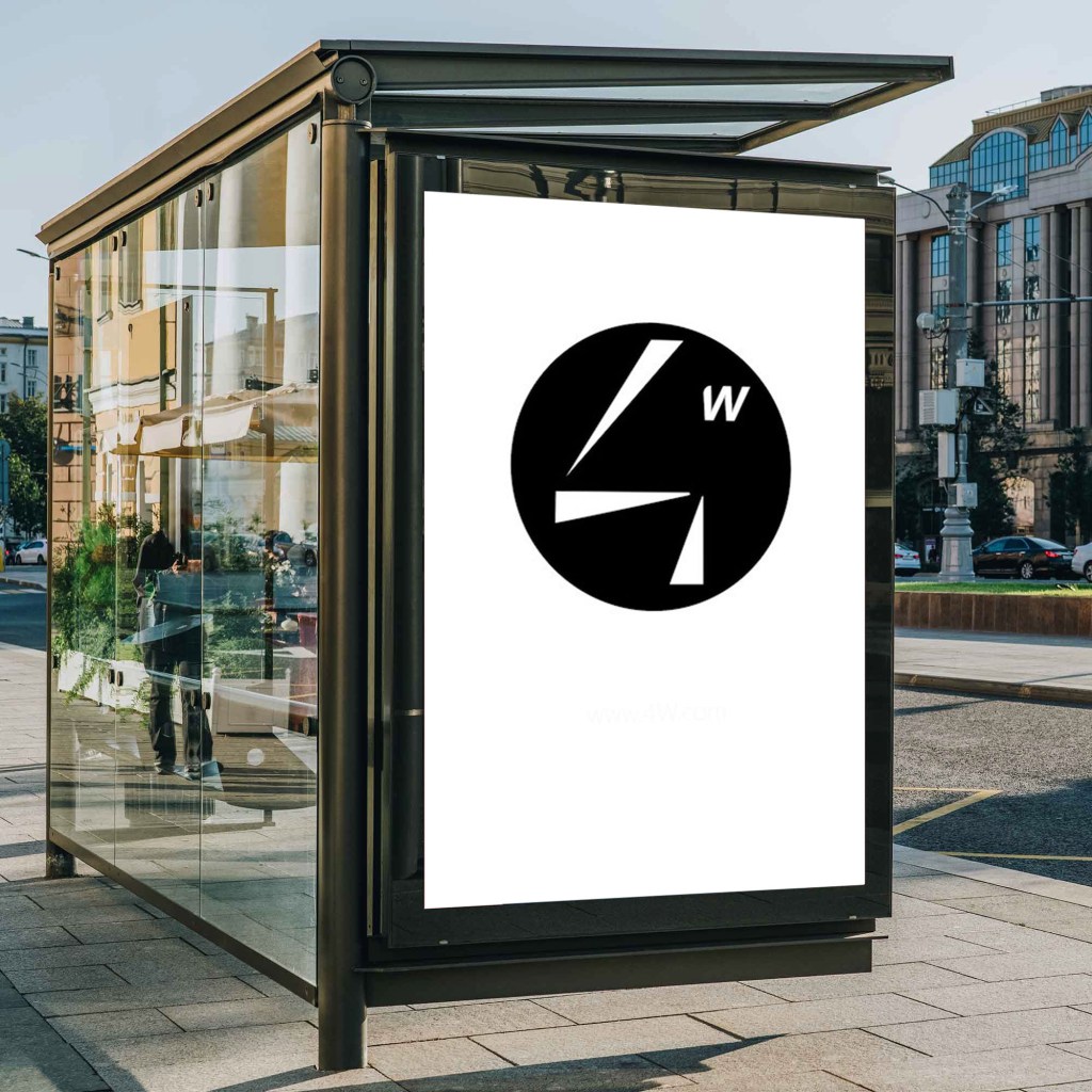
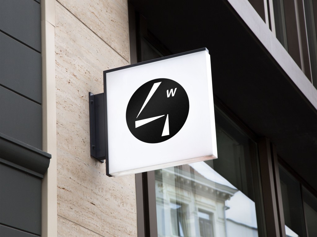
But since its very hard to see if something actually works unless you put it in context, I decided to do a mockup for the logo in Photoshop, this was the result:
LOGO ANIMATION
As I said before, I made the logo animation having in mind what I thought was my final logo design. I decided to make it five seconds long and include a slogan and the web handle. I also researched the correct format for a bus stop. I made this in after effects, by request of my teachers, and it was incredibly challenging. these are the main frames.
After deciding that that one random frame was to be my final logo I made some adjustments and created the final animation. This is it:
I also made some mockups for how the animation would look like in a bus stop, but since its a bit too advanced to imbed the actual video in the bus stop i decided to just add the most important frames.
BUS STOP ADVERT
This was by far the hardest part of the project. I have lost count of how many hours I spent in this section. At least, since I learnt after effects for the logo animation, I didn’t have as many issues with software.
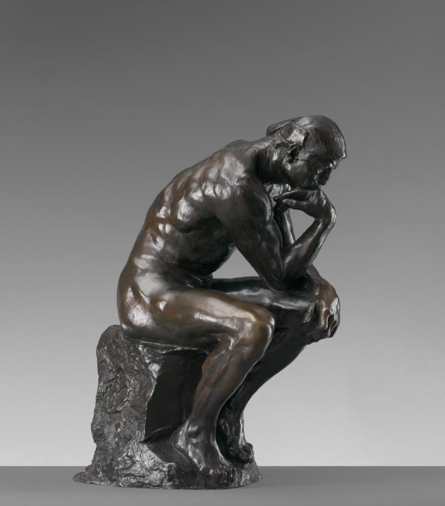
After the first session of feedback for the logo design I was told that the four looked like a person in a sitting position, and that triggered the main idea for this ad. I was going to film a friend walking down the street (using the video as a template for the animation and using triangles to represent the body) and coming up to a bus stop, where that person would look and transform into the four, with the slogan ‘think about it’ below it (observing the simile between the sitting position and rodin’s ‘The Thinker’).
So I filmed my neighbour back in Spain walking down the street and attempted to animate it, but the triangles didn’t really work, the movement was unnatural and there was something lacking. I was in a rut.
So after a couple of days I decided to go for a walk to clear up the ideas in my head and see what I could change, so I walked through the riverside and suddenly I had one of the biggest bursts of inspiration I have ever had, recording a 1 hour long voice note of the ideas i was coming up with.
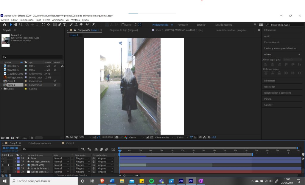
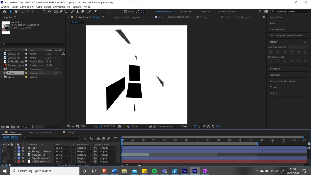
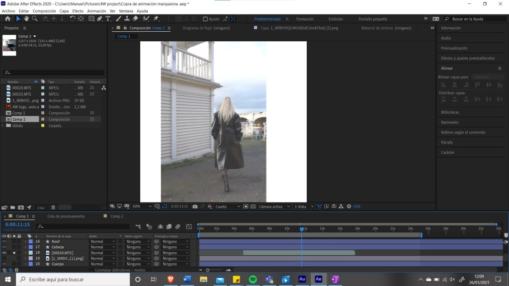
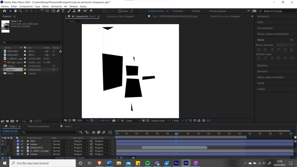
I realized that it lacked context, I could use basic shapes (like triangles or squares) for the person but the surroundings also had to be in that style for it to work and give the illusion of space. There is a very fine line between abstraction working or not and usually context is the turning point. So I decided to re-record the whole thing the next day and start from scratch. These are some examples of my process:
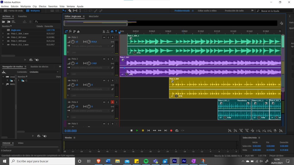
I also had the idea to incorporate a small jingle to the video, so I asked a friend to lend me his microphone and recorded a small song in about an hour. I also had to learn Adobe Audition to do this, but it wasn’t a problem because I was familiar with other audio editing softwares.
I used the guitar I had in my bedroom and for the rythm I just made it tapping on my table and on the port of my phone charger. This is a screenshot of my process:
So for the animation I noticed in the last second, since the person had to transform into a 4 to create the logo, that the video was in the opposite direction that it should be, so somewhow I managed to invert and position correctly each layer, add text and insert the audio. This is the final result:
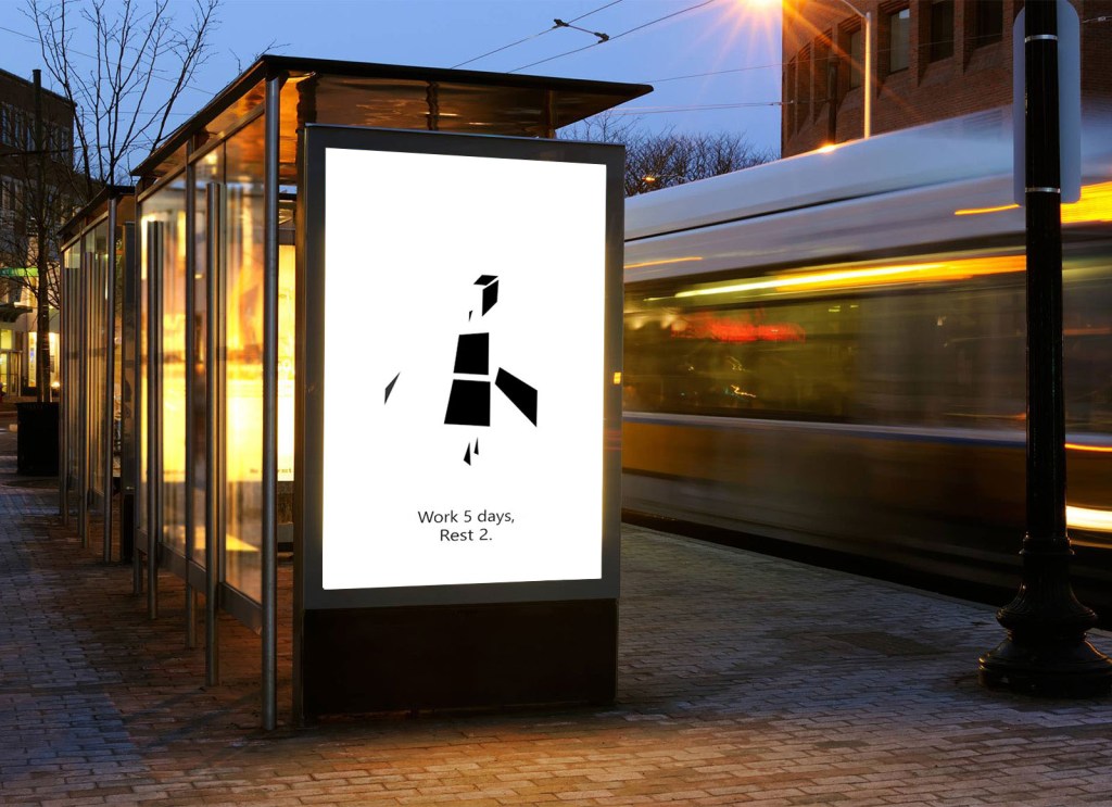
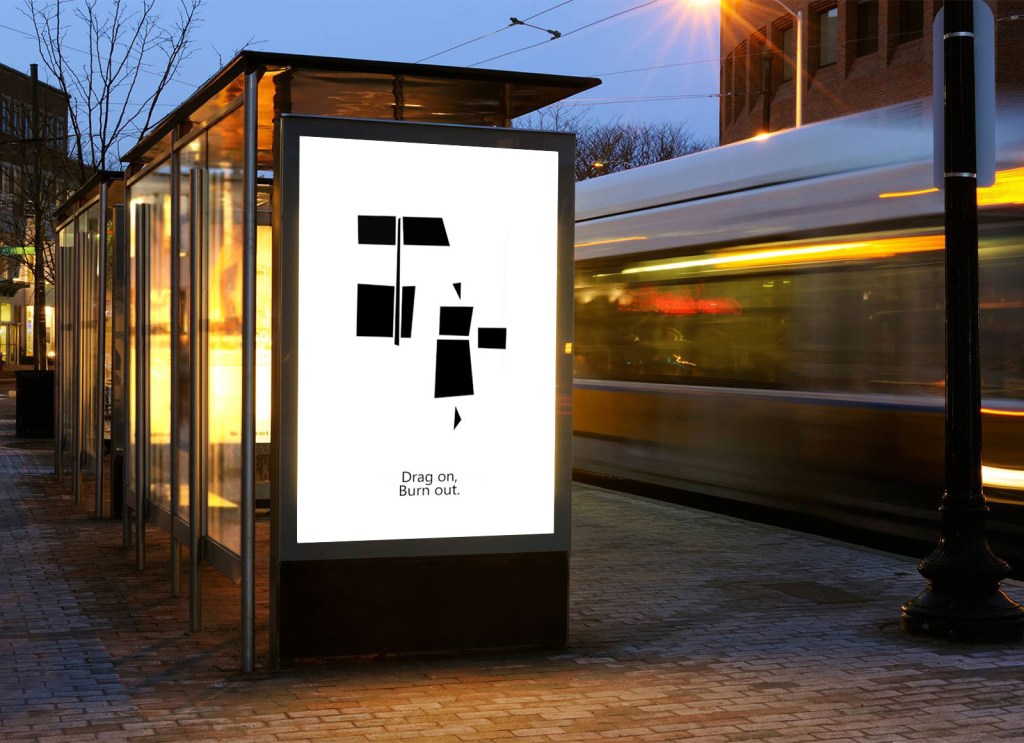
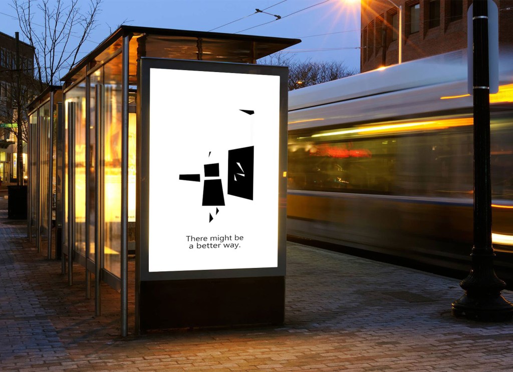
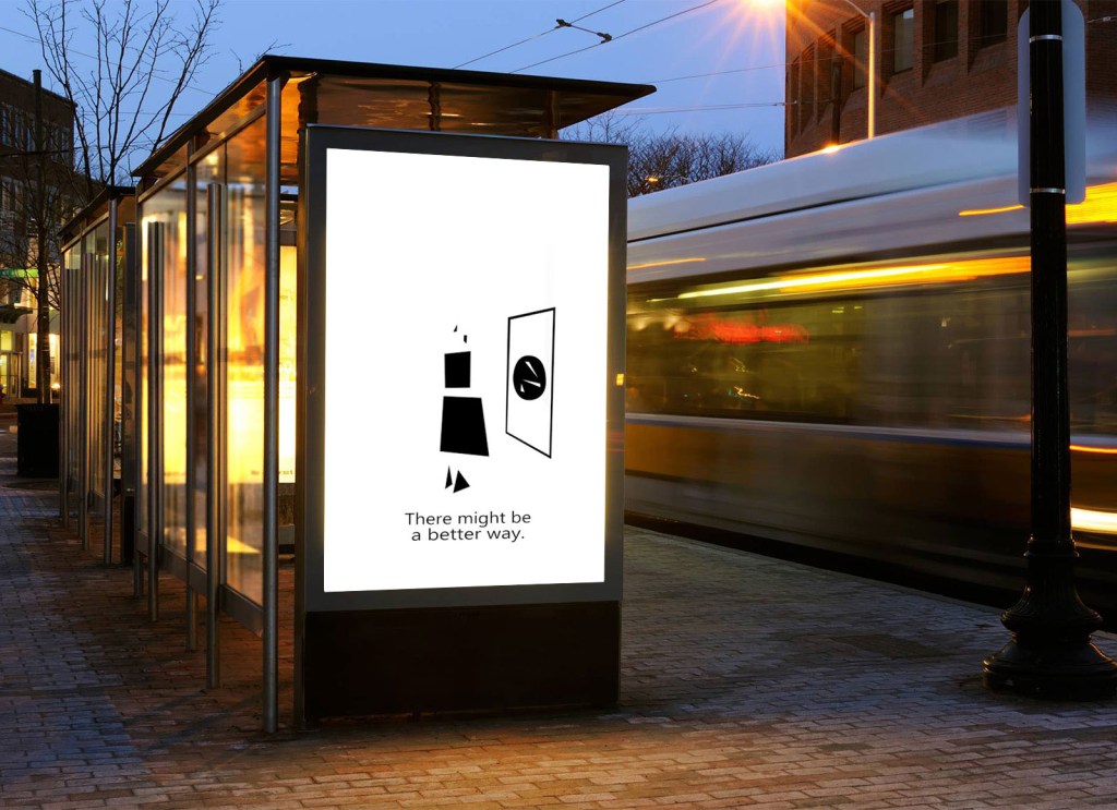
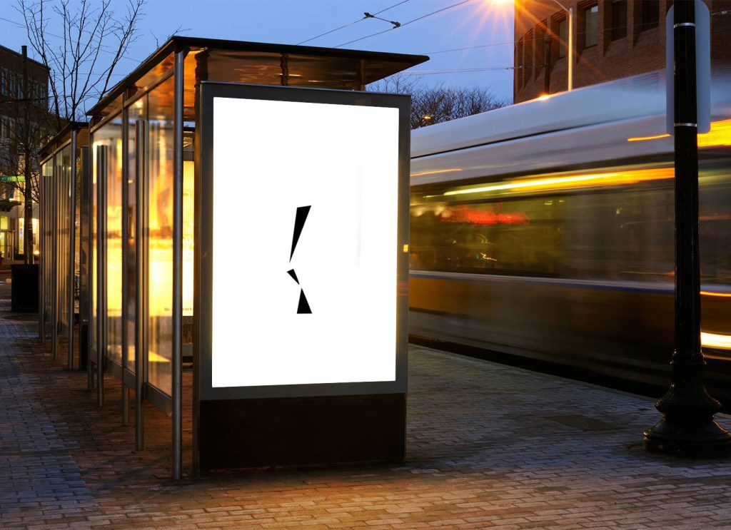
I made some mockups for this one too! This is how it would look in a bus stop:
CAMPAIGN
We were also asked to think about how all these different creations could come together in real life in a marketing campaign. I was very inspired by a lof of companies the 90’s (like MTV for example) that for different segments or in different events they created different animations, giving a very strong image of creativity and constant innovation (channel 4 is also an example). I thought that, if I had the tdifferent animations for the logo, always ending up with the slogan and the website handle.
These animations could appear, although mainly on bus stops, also in the website, in the tube, YouTube or Instagram ads etc. so that it gives the illusion that they are everywhere. And taking into account that the slogan is ‘Think about it’, people, seeing it everywhere, will think about it sooner or later.
CLOSING NOTES
As I said at the start, this has been the most challenging project so far; but it also has been the most rewarding. I learnt, through LinkedIn courses and YouTube videos (also with the inmense help from the course group chat), Photoshop, Illustrator, After effects, Audition and Indesign. One day I woke up and my brain started putting square corners in the furniture in my room as if it were resizing it in After effects. I also had to re-make many elements and constantly try to not conform with what I had but try to make it as best as it possiby could.
And I believe that I have achieved that, I think that I have done the best that I could, taking into account the limited skillset that I have. I have been ambitious and for once I think it has really worked.
But there are some things that looking back I could have changed or done slightly better. I think that the jingle is not that good and it doesn’t really go with the tone of the commercial, but to be honest I did it just for fun and I can’t really ask more from it.
Also I feel that I could have included color somewhere, The monochrome gives everything a very streamlined look and also makes it more serious; but a bit of color would have done no harm. I could have done more concepts substituting the black with other color but I am too exhausted from this and my brain can’t take eny more. For the next time I’ll surely try it out.
Also a problem, which is also the charm, of the 20 second ad is that it’s very abstract. If this was the only piece of marketing that the company had I don’t think that people would understand it so well; but if the marketing campaign that I explained earlier were to actually happen, I suspect that its abstraction wouldn’t be a problem at all (since there would be more messages that compliment it).
So in conclusion, I feel very fulfilled and happy about what I have created, I just hope that all this work was not in vain. Also hopefully in a few days I feel ready to confront the next task with the same energy as I havd with this one. Thanks for reading.
BIBLIOGRAPHY
https://computerhoy.com/noticias/industria/empresa-espanola-jornada-laboral-4-dias-568645
