
Prompt given on 02/02/2021, finished on 03/03/2021. This project was given only three days after the deadline of the previous one. I rested during the weekend but still felt like I wasn’t 100% energized. I would try my best. The prompt was:
- Create a perfume campaign for a fashion brand of your choice. The brand shouldn’t currently have a perfume and you don’t need to include a perfume bottle but can do so if you wish. Your campaign will be creative and contemporary and epitomize the essence of your chosen brand. You will create a 30sec + film to promote the perfume, to be shown onNowness.com and an A4 still image advertisement to be placed in AnOther magazine.
I was for the rest of the class and perhaps a few hours after in shock. I had to film an ad (with its corresponding music), make an A4 still-image and, even though it was not required, design the perfume bottle. There were numerous problems with this. At the time of this project, England was in lockdown, which meant that that you couldn’t meet with more than two people outside, or meet with anyone inside. All studios or indoor spaces (that were not public) were closed, there also was no access to university facilities or resources.
We can see how this plays out, meaning that if I film people in it, they must be 2 maximum, outside and with no access to extra lighting or equipment (luckily I had a camera with me).
Another problem I found was that this is, in the end, a fashion brand; and a perfume, although bringing profit, at the end of the day is a marketing strategy for the brand. Most parfum commercials connected to a fashion brand feature their clothing or accessories at some point. Also the actual parfum bottle appears usually but can also appear as a picture in the end, so it’s not the worst. The thing is that I don’t own that much clothing and nothing from a fashion brand.
RESEARCH
Then I went on to research different clothing brands to see what would spark interest and inspiration in me, I looked up a list of brands sent by my teachers and selected my favourites. Designers like Craig Green, Gareth Wrighton, Grace Wales Bonner or Nensi Dojaka really stood out to me and will definetely be a source of inspiration in future works. I also researched some brands that I knew like ColdArchive, Masnada or TAKA_Original.
After careful consideration I rounded it up to three options: Nensi Dajaka, TAKA and Cold Archive.
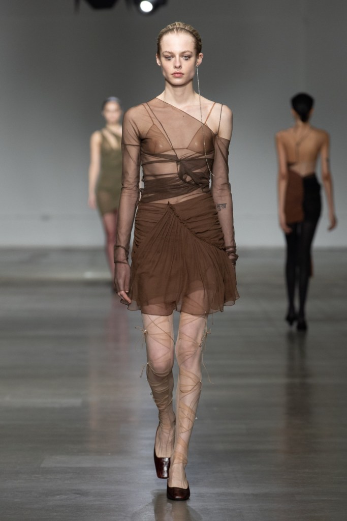
Nensi is an Albanian designer characteristic for her deconstructed and fragile style, layering materials with different opacities (usually in very muted colors) to create unique and beautiful pieces of clothing.
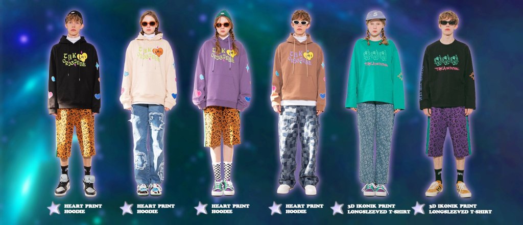
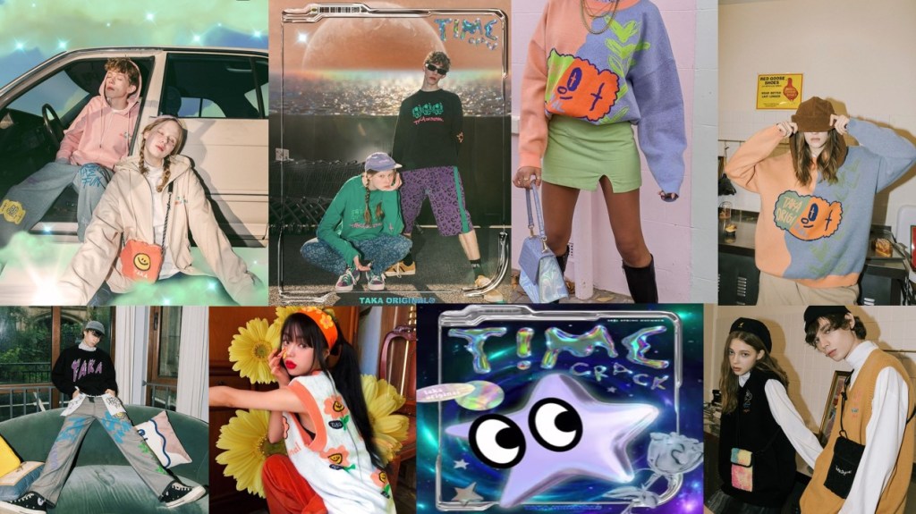
TAKA is a streetwear brand from Japan with very warm, cozy clothes with a very modern look; the aesthetic is usually ironic but in the best way possible. I heard a friend describe the brand as adult pre-school clothes.
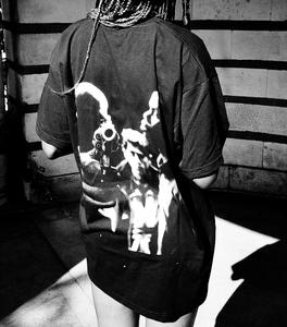
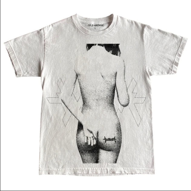
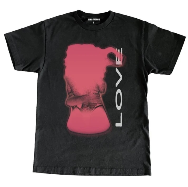
Cold Archive is a British curation platform and fashion brand that attempts to archive images of forgotten or obscure subcultures, digging on every corner of the internet to find extremely impactful and seductive images. Their clothing centers on streetwear and random products like rugs or incense holders.
I could see all these brands realistically releasing a parfum in the future, specially Cold Archive, and I had many ideas for the three of them but there were some logistic problems:
- For Nensi I would like to make a perfume bottle which, with superimposed layers of materials, could mimic the aesthetic of her clothing. The problem is that since her clothing is the main emphasis of the parfume and her style, although simple, can’t be easily replicated; I would have to include one piece of her clothing in the ad so that the parfum would make sense. And that’s just not possible (which is very sad).
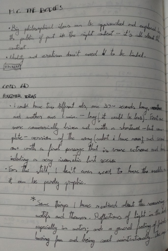
- The problem with Cold Archive, as much as I love the brand, its future potential and what it stands for, it isn’t a fashion brand per se. I wouldn’t be surprised if tomorrow they released a parfum but since it’s not exclusively fashion I might have had some pushback from the teachers.
On the plus side, Taka is 100% a fashion brand (even though they do more than fashion) and their style, although not perfectly, could be mimicked in a commercial with some clothes that me or my friends own. So that one is would be my Plan B.
Since I couldn’t decide between the two of them I decided to research both, taken into account the guidelines set by our teachers.
Cold Archive:

- What is important to this brand? To bring to the surface and document artists and cultures who would otherwise remain hidden.
- What is their mission and their goals for the future: probably expand (due to their growing popularity) and become a full on marketplace and platform. The brand is only 1 year old. Also to show the work young and not-yet-konwn artists via their account coldarchive_youth; where you can submit your work to be shown to thousands. To be honest it’s very hard to tell how this brand will look like in the future, they have evolved so much in only one year but I only expect them to get better and better.
- How can they make their customers lives better: inspiring them creatively, providing entertainment and helping them to re-discover their past and learn about their present.
- Who is their target audience? Since it focuses mainly on youth, mostly young people from the ages of 18-35.
- •What are their customers interests? Underground and cutting edge art and culture, new and old. Very cold, dark, psychedelic and (even though I hate the word) ‘edgy’. Also,very importantly, fashion. This platform puts a lot of emphasis on it, past and present.
- What do their customers what want to see and hear about? Probably good quality random and unexpected things, that’s why I think that a perfume could suit this brand so well; I’m pretty sure that the customers would absolutely love it (hypothetically).
TAKA Original

–This brand has changed quite a lot since their opening in 2015 so I will talk about where the brand is now–.
- What is important to this brand, not only in commercial and industry terms but on a broader, global level as well? Since it’s a very youthful, happy brand I’d say to provide clothing and accessories that make you smile when you see them, they also had an iniciative of helping artists to get there content out there but because of Covid it seems like it is on standby.
- What is their mission and their goals for the future? To innovate, continue pushing the envelope and mix new aesthetics and trends into their style.
- How can they make their customers lives better? As I said, to make them happy through their fashion.
- Who is their target audience? Definetely youth, from 16 to 30 probably. They are based in japan but thanks to their instagram marketing campaigns they have gained a lot more recognition in western countries.
- What are their customers interests? Since right now they mix techware and cutecore, aside from the streetware classics, definetely subcultures, internet culture and comfy things.
- What do their customers what want to see and hear about? It’s, right now, a very ironic brand. Their website is filled with tacky 90s style lettering and patterns and a lot of their products follow on the same line as well. I’d say their customers would want to see where this brand moves next but without leaving that light-heartedness and laid back attitude behind.
I decided to made a moodboard for each brand

In our first feedback session I presented both brands to my teacher and she really liked both, and also gave me the green light to go with Cold if I really wished to (since the brand is deeply related to fashion).
I knew it was a risk but i decided to go with Cold Archive, I think it would be very realistic for them to release a parfum and, as much as I like and relate to TAKA’s aesthetics, Cold is much more in line with who I am and what I like. It also allows me to have much more creative freedom and do pretty much what I want, but this is also a problem, because their aesthetic is although very broad at the same time very difficult to define. So I would have to do a very good job if I wanted this to work.
BRAND DNA
Cold Archive is a new brand, only one year old, and although it doesn’t have a rich history behind it it’s surprisingly defined, concrete and sure of what it is. It inspires a sense of rebellion, discovery, curiosity and impulsiveness. Although it doesn’t have a set ‘tribe’ it does have a very strong fanbase, which I would guess is mostly comprised of people who relate do that outcast and noncomformist lifestyle, of constant creation and destruction. It’s set apart from other brands by its duality between the fashion world and journalism / art curation.
This gives a very big variety of things to work with and showcase in both the ad and the perfume itself; cutting-edge, agressive but subtle.
BRAND VALUES
–I researched this area when i did the comparison between TAKA and Cold, but I’ll update it here anyways–.
- What is important to this brand? To inspire through their archive of underground culture and art, and to provide innovative and good quality clothing and accessories to their customers.
- What is their mission and their goals for the future: probably expand (due to their growing popularity) and become a full on marketplace and platform. The brand is only 1 year old. Also to show the work young and not-yet-konwn artists via their account coldarchive_youth; where you can submit your work to be shown to thousands. To be honest it’s very hard to tell how this brand will look like in the future (due to the improvised nature of the brand), they have evolved so much in only one year but I only expect them to get better and better.
- How can they make their customers lives better: inspiring them creatively, providing entertainment and helping them to re-discover their past and learn about their present.
- •What are their customers interests? Underground and cutting edge art and culture, new and old. Very cold, dark, psychedelic and (even though I hate the word) ‘edgy’. Also,very importantly, fashion. This platform puts a lot of emphasis on it, past and present.
- What do their customers what want to see and hear about? Probably good quality random and unexpected things, that’s why I think that a perfume could suit this brand so well; I’m pretty sure that the customers would absolutely love it.
TARGET AUDIENCE
I’d say the platform is aimed mostly at youth, but obviously an adult audience (some of their images display graphic and explicit content). So perhaps 18-35 would be a good demographic, although i’m sure older people could like it just as much.
Even though the brand is based on the UK, It was born in the internet (they don’t have any physical store that I’m aware of) and since they showcase cultures from all around the world I wouldn’t pin-point any specific country; although me being in the UK is perfect. Language-wise, English is the language in which the brand communicates.
Now it’s not a cheap brand but it’s not expensive either. Their quality is above average, long-lasting and the designs are very well thought-of, so I would say the price is fair. Their t-shirts exist between 30-45£, hoodies between 40-50£ and their rug costs 250£ (they would usually have more variety under the ‘other items’ category but Covid has made them shorten their stock).
Since we are dealing with underground culture, I wouldn’t put any distinctions in gender, class or race; But since the prices are not cheap I don’t think people with very low income could afford it (at the end of the day it’s not fast fashion). I would say the spending patterns of the customers would be of buying few things that they really like and are really good so they can last as long as possible.
Ideation
Before starting with the project, I thought about a couple of things regarding my work ethics (in university). On order of inportance.
- Create something that fulfills the brief.
- Create something that I like, ejoy and feels genuine. Do the best with what I have.
- Create something that could be commercially viable, taking into account that my work is not that good yet.
- Create something that stripped of its commercial value is still artistically and emotionally expressive.
In an ideal world all of these conditions would be fulfilled at the same time, but I’ll try my best.
Anyway, talking about the actual project, there were a lot of things going on through my head during this project: I had been fascinated about the reflections of light in objects during the night, the shapes that they create and their abstract quality.
Before starting with the project I went out several nights to photograph and record lights reflected in the river Thames and certain objects, like cars, boats and trains. Also how the light reflected in the glass while drinking water or coffee and drawing how the streetlights project inside my room at midnight.
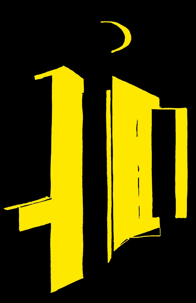
I considered making a series of paintings or collages about this topic but then I figured that I could use that idea for the ad and the still image. I spent many days exploring my surroundings at night looking for possible filming spots, small details and little things that could serve a purpose in the future.
Something else to consider is that during this period I finished reading John Maeda’s “How to speak Machine”, by reccomendation of one of my teachers. I was very inspired by this book and specially the idea of loops, so that’s why both the song and the video are glitchy and mostly loop-based.
Regarding the perfume itself, I decided to go for a fresh unisex fragrance with a touch of blueberry. I decided to call it ‘untitled.’, making reference to the art culture and sometimes not even needing to name a piece. I thought it was simple, recognisable and in line with the brand. I also decided to make a perfume instead of an eau de toilette since the bottle capacity is very small, so it would have to be more concentrated.
This perfume would be fairly expensive but very good quality, both in the fragrance and the build of the bottle itself. So fair priced. Around 50-70£
These are some general ideas I had before beginning, most of them are text-based but i’ll include them anyway:
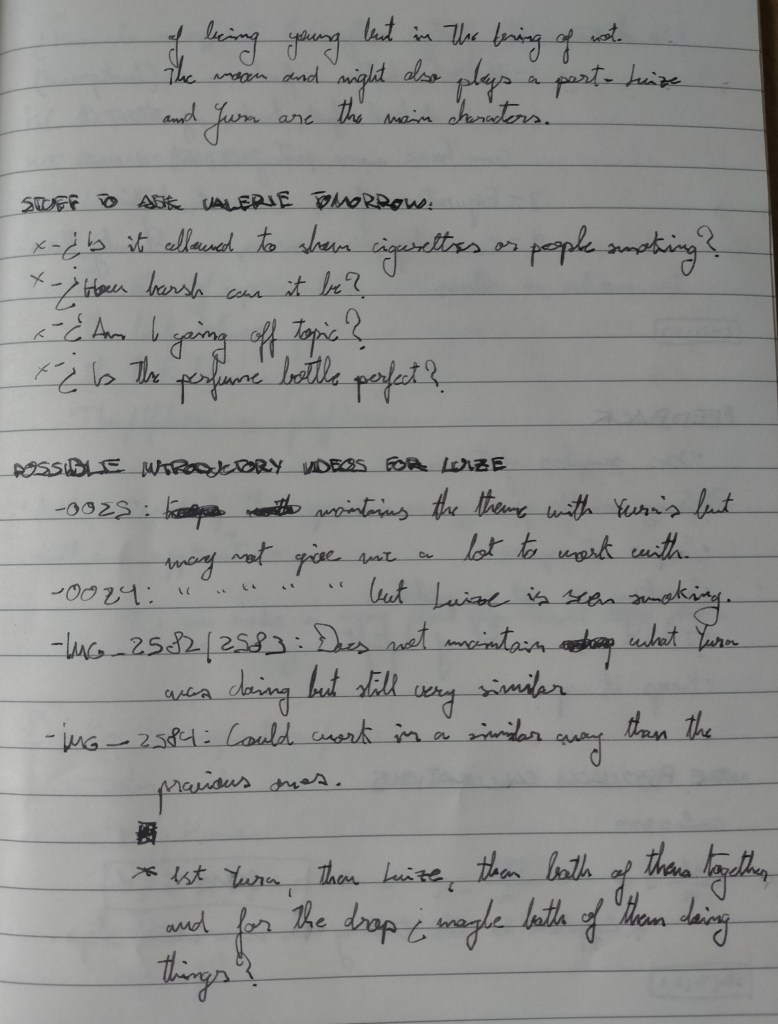
AD
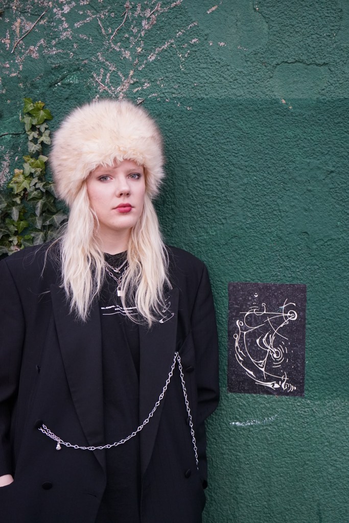
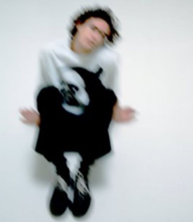
I had a fair amount of abstract footage from the midnight walks I previously mentioned, but of course I wanted to show modeals and more cinematic scenes. I got my friends Luize and Yura to model for this project, and since they are more knowledgeable in fashion than I am I left it in their hands to pick the outfits –where I had to use clothing that was similar in aesthetic to Cold’s–.
We went filming, also with my friend Liza (to help with lighting / shining the phone torch). We went at night and really liked the results, but when I got back home I realized that all the footage I filmed (due to the low lighting) was choppy and almost unusable. I was in a rut.
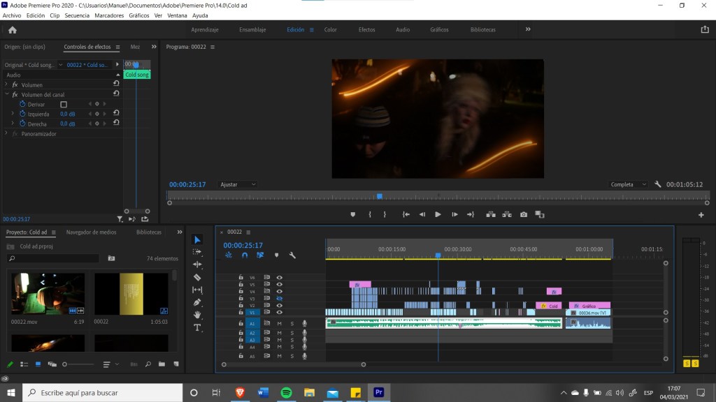
I was feeling very down the next few days, until when I revised the footge I realized that the chops aligned perfectly with the beat of the song I was making. And I had an idea. I thought of making the visuals align perfectly with the music, following its melodic and rythmic patterns. This is and image of the process
I did a few tests and it actually worked, I just had to go again to film –this time i decided to go just when the sun set, also to a different location– so I could compliment the lower fidelity images with more flowy, cinematic ones.
The next week was based on editing and putting everything together, taking bits and pieces together and combining them out of pure intuition but with some sort of order. When I finished designing the bottle I also included rendered images of it to slowly tease the design until the mockup was shown.
SONG
Since I decided to base the video in the rythms and melodies of the song, I had to finish it first. I decided to go with a very simple guitar loop and harmonizing it as the song progressed, switching through various rythmic patterns to give a sensation of unease and release.
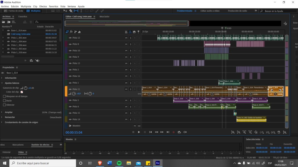
I quickly realized that I had nothing to make the drums with, due to lockdown, so I decided to sample things that were in my surroundings, like my mug hitting the table, the plastic door that leads to my bathroom, my camera’s shutter and some accidental recording sounds. I took these raw sounds and modulated them to produce the sounds that I wished. These is an image of the process:
Cold Archive’s aesthetics are especially influenced by experimental, rave and punk culture, so I decided to go for a very minimal and subtle techno-y beat. I finished this section and it sounded good but it didn’t have the edge that I wanted. I was inspired by Black Dresse’s “Damage Supressor” to make a more harrowing section so I decided to make a 1 minute ad instead of a 30 second one and add a harsher, more intense passage. I decided to go for a classic death metal double kick drum, with a techno tone, a snare drum on the beat and a cymbal that went off on the off-beat to give it a dance feel. I borrowed my friend’s guitar amp and wrote a very melodic black metal wall of sound, contrasting dissonance and resonance.
I saw that the shift from the mellow and harsh sections was incredibly abrupt, so I decided to sample Ovlov’s “Where’s my dini”, on the moment right before the breakdown, where the guitar makes a satisfying scratching noise. I also sampled a hardcore techno screech from Angerzam’s “Mashup 1”. Finally I saw that I couldn’t make myself a cymbal sound that sounded decent, so I sampled Burial’s “Raver”.
I’m very happy with the results of the song, it doesn’t sound off at any point and I believe it goes in line with the brand.
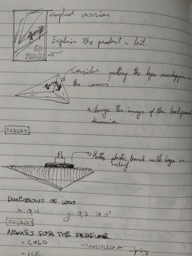
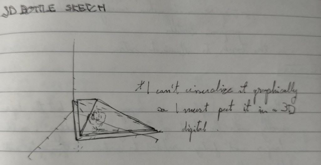
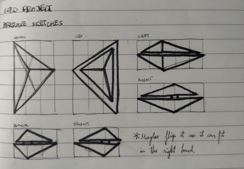
BOTTLE
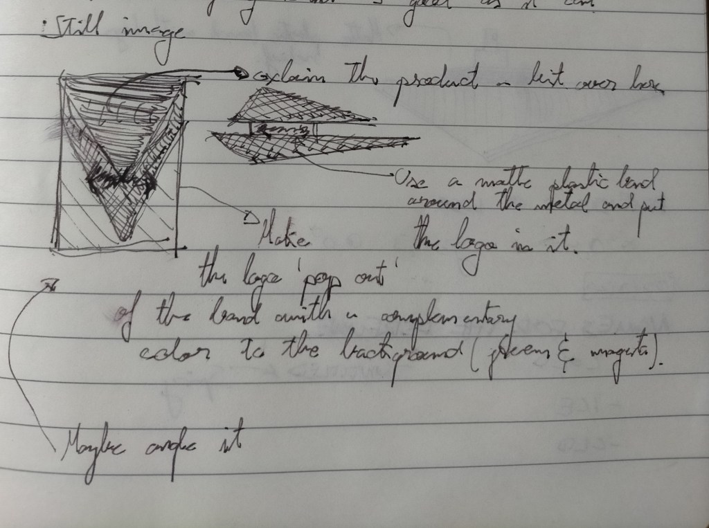
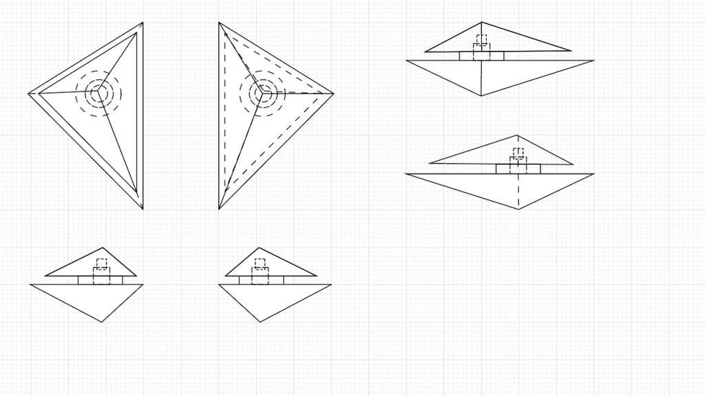
The bottle design whas somewhat recycled from an idea I had from a design project I made last year, heavily influenced by Dior’s “Sauvage”, probably my favourite perfume. I decided to tweak the proportions a bit –following the golden ratio– and change the location of some elements. This is the blueprint I made.
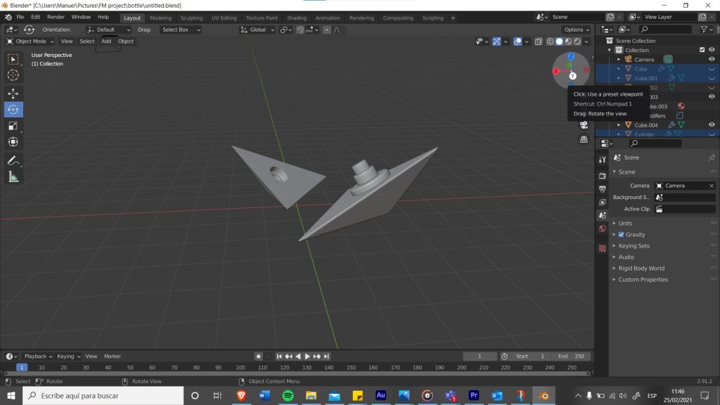
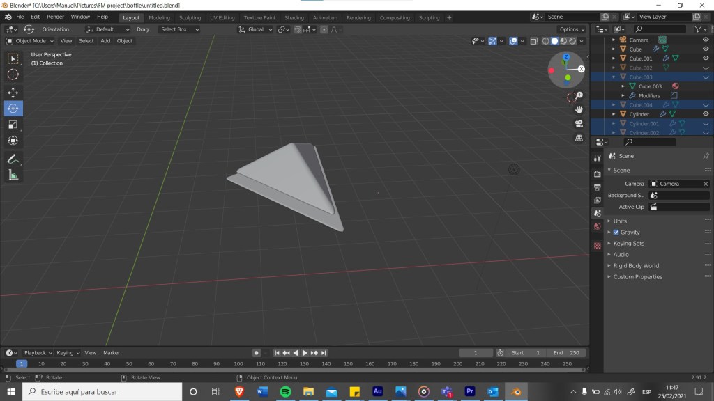
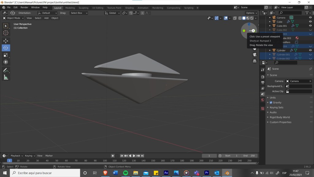
Then I went into Blender to make it in 3D. I decided to round up the edges since I saw that a pyramid with sharp edges could be dangerous to hold and use. This was my model
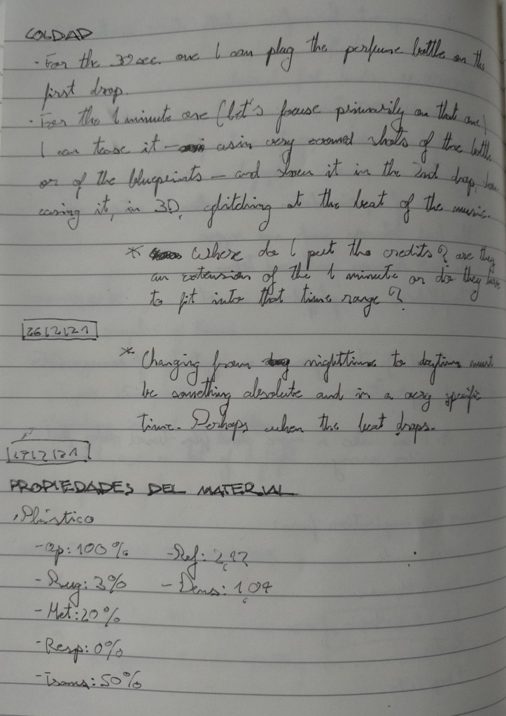
Then I moved that design to Adobe Dimensions, I did this to add lighting, materials, graphics and background. I made the bottle with a very dense glass cap and a semi-translucent bottom. All tinted black, inspired by Sauvage (I wanted it to be a bit smoky but Dimensions wouldn’t let me). I decided to add the logo on the metal ring that separates the cap from the bottle, but seeing that it would’t be noticeable I experimented with adding a black matte ring enveloping the metal one, where the logo would appear in relief.
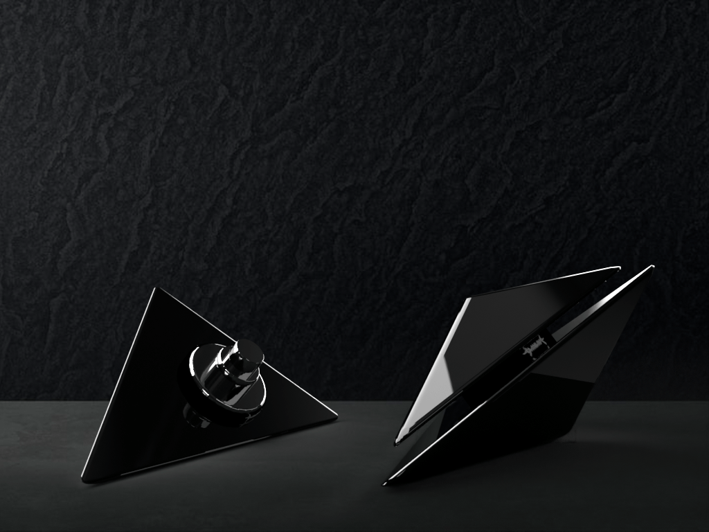
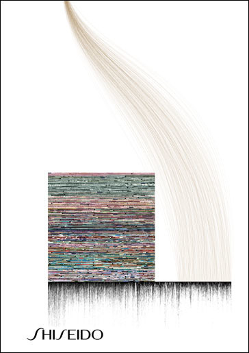
Here I made the mockup for the ad, some stills from the video and the mockup for the poster.
A4 STILL
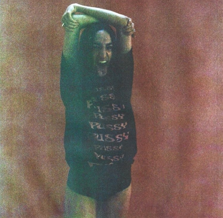
I didn’t put as much effort on this part at first, since I was so busy with the ad. I saw that I had to show the bottle in some way, but since I had already done a mockup for the video I decided to use one of my model’s hands to pose as if she was holding the bottle. And because it had to appear in An Other it must be somewhat expressive. I was very inspired by many of the graphics from Cold Archive and their editing style, which I unconsciously emulated (since I took the picture at nighttime and that was the only way it could be visible. The typography is also very inspired in Cold Archive. These are some examples of this:
I used Dimension and Photoshop to put the bottle in her hand. This was the process.
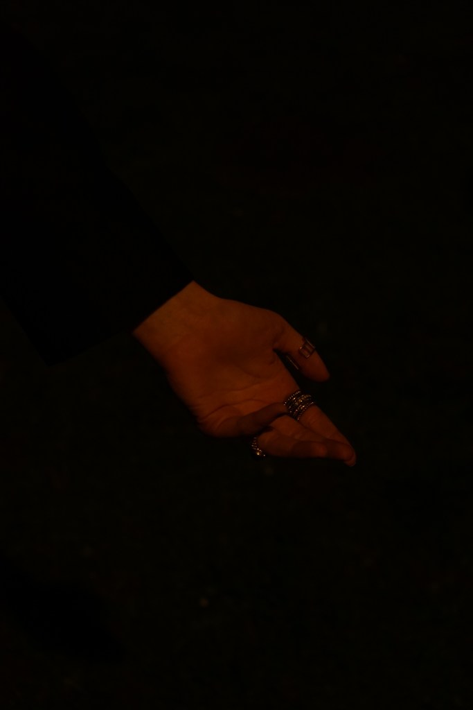
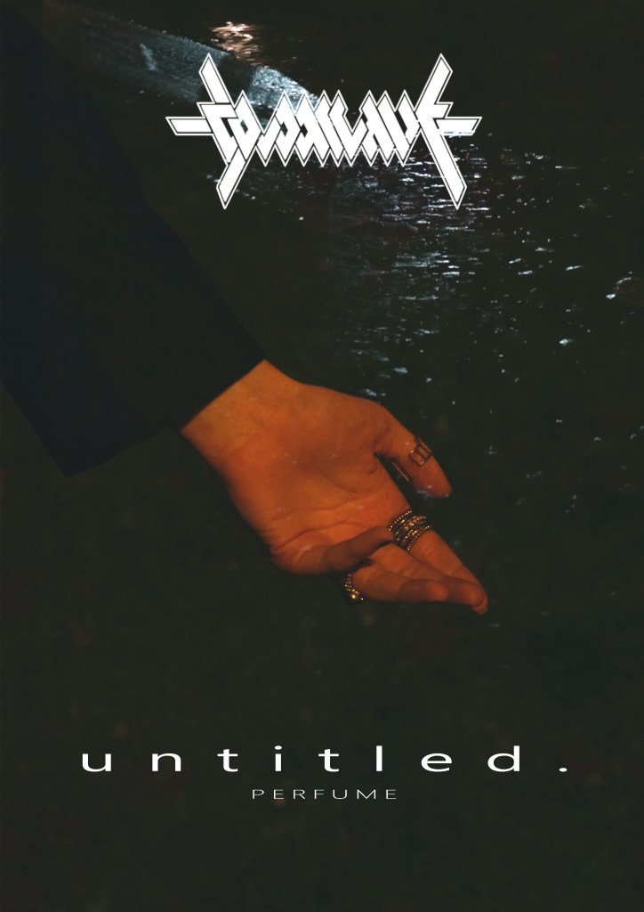
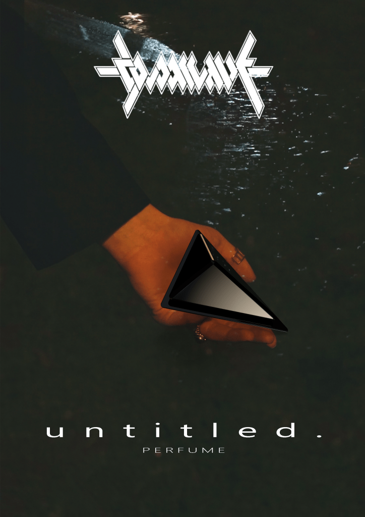
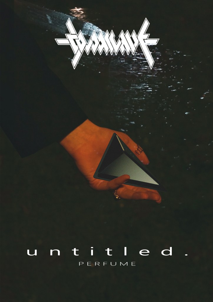
I think it’s apparent that it’s CGI’d but it’s the best I can do for now. I like it nontheless.
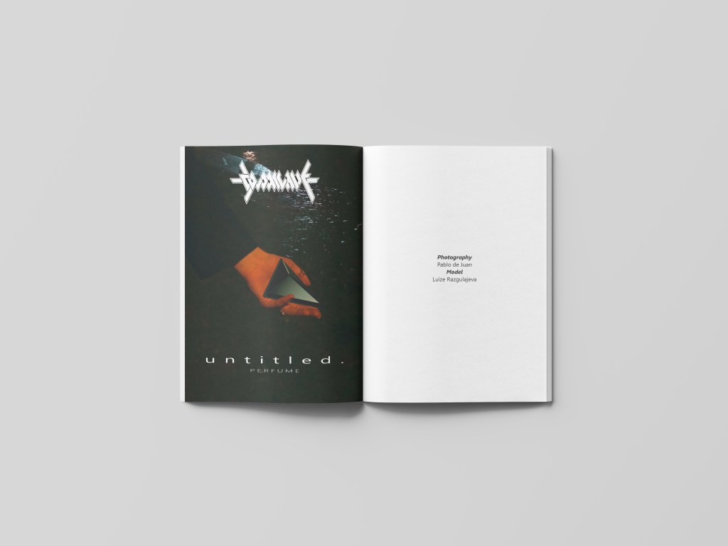
Since it’s going to An Other magazine I thought it was only fitting to do a mockup of this. I didn’t style it as the front cover so I reaserched the usual layout of AnOther and found that it’s usually one page with the image and the next page with the credits of it. This was the result:
CONCLUSION
I am extremely happy with the results of the project, especially with the video. I think I have put all the effort that I possibly could into this and could’t bake it better if I tried –at least with what I have right now–. Also, apart from being commercial, I have expressed a lot through it and really reflects what I was feeling at that moment; it’s not manufactured emotion.
I would of course have liked to use Cold’s clothing in the ad and make a physical bottle, but for obvious reasons that was not possible. If I went back I would have taken more pictures of the process, but sadly I either forgot or didn’t consider at the moment that what I did was worth documenting.
I believe this might be my best work to date, which is not saying much but for now I am satisfied. I couldn’t be happier with it and I hope that other people also find it enjoyable. Thanks for reading.

3 thoughts on “COLD ARCHIVE PERFUME”