Project finished on the 30/08/2021. This project was meant to be on the homepage of this website but I found it interesting enough to talk about. I was making some updates on the website to reflect better who I am and what I do. One of the main things I had to take care of was the website logo. I played with several ideas but nothing seemed to represent me enogh. These were some of the first drafts:


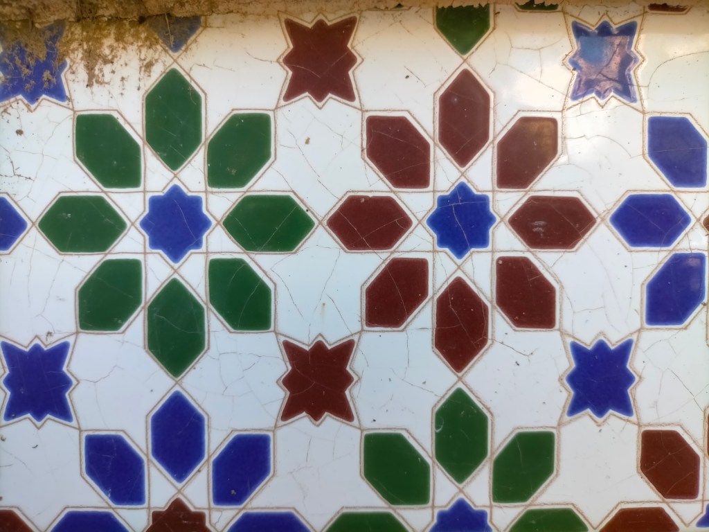
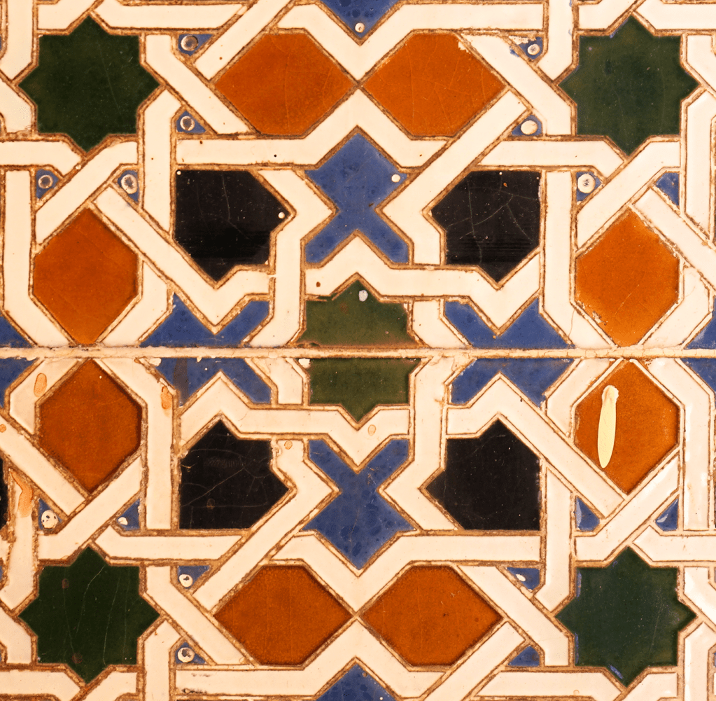
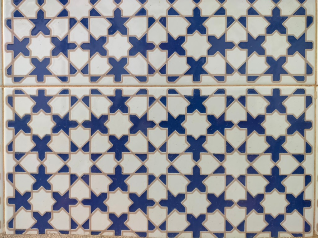
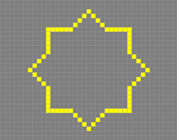
Then I thought I should base it around a form or symbol that meant something to me or represented me in some way. I started thinking of the tartesic star (or eight-pointed star), a symbol that has been used in Spain for thousands of years and is ever-present in architecture and design, especially in the ‘mudéjar’ style, which is a mix of Moor and Spanish elements (prevalent during and after the Moor reign in Spain from 711-1492 b.c.). In the Muslim tradition it is meant to represent paradise, as it is supposed to be surrounded by eight mountains; but in Spain its used in a secular way, purely for aesthetic purposes.
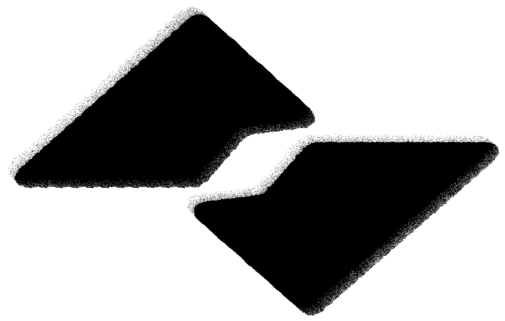
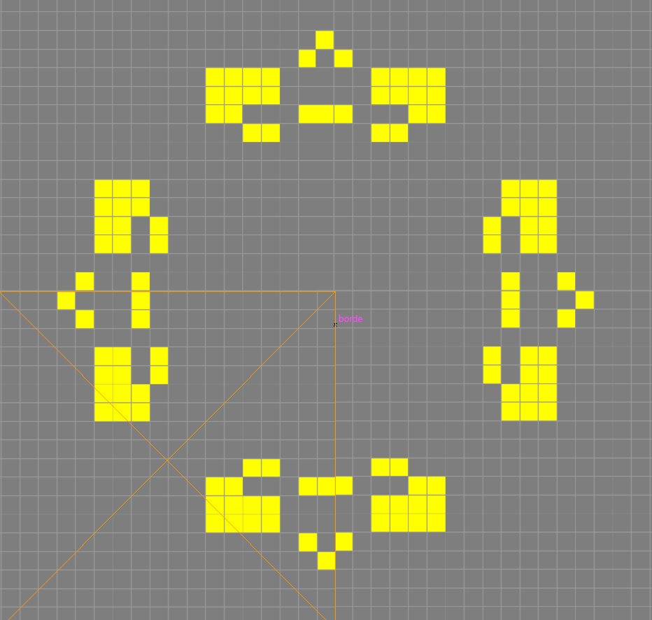
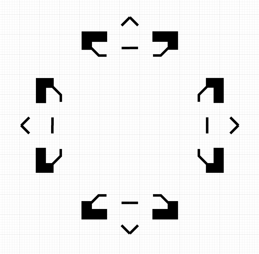
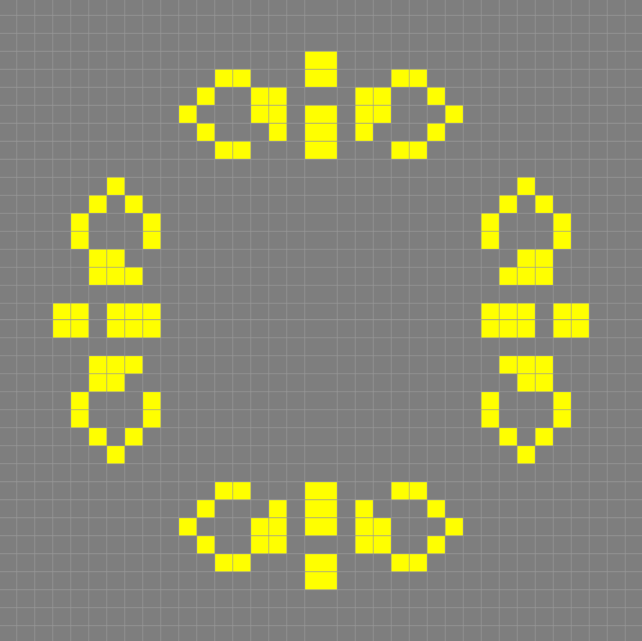
I started playing with the shape and different variations on it, when I had the idea of inserting the symbol in Conway’s Game of Life, of which I have already talked about in another blog post. I played with different dimensions and proportions until I found that 19 x 19 pixels in the base square made the succession stable. I started looking at the variations that the algorithm produced and realized that I could not only make a logo from it, but that I could make an animation for the homepage.
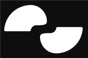
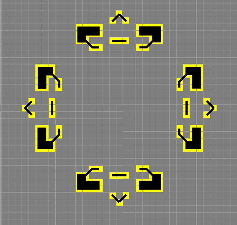
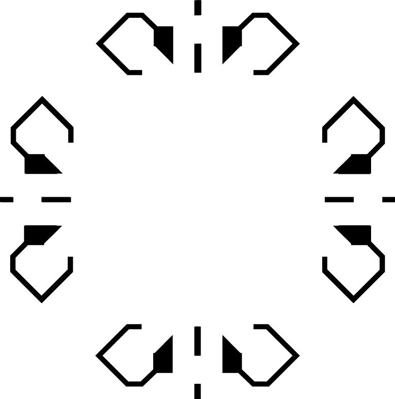
I decided to not use the pixelated design that Conway has to offer, I saw that if I drew a vector line with each point in the center of the pixels (filling in the places where there was more density) I could create a much more unique and visually appealing design that also reflected my aesthetic better. The original sequence has around 200 variations until it becomes stable, but since I had a time limit I decided to make 50 (it ended up being 54) and reverse it to create a gif.
This was the end product:
I moved on to make the logo, deciding to use various iterations to try to make Icons out of them, these are some examples:
The 4th iteration caught my eye specially, so I decided to base my logo around it. I tweaked the proportions a bit and added the eight-point star in the center. Thus creating a more modern and streamlined version of the star.
This was a project that I completed in a very short amount of time, but I was extremely happy with its results. Since it was born out of a very quick experimentation I feared that it wouldn’t work out but I ended up, without realising, mixing tradition (the animation and the logo have a very strong resemblance to the “mudéjar” style) and modernity; using a mathematical algorithm in the form of a video game that emulates life. All of this without taking into account that I ended up having a functional logo and a beautiful animation to showcase as another project. Thanks for reading
