Brief given on 18/01/22, project finished in 28/01/22. This was the second brief we recieved on the Live Case Studies module. A live brief set by Papa John’s to continue their marketing campaign from last year. Focused on re-thinking classic elements of the delivery driver (jacket, cap, bag etc.) and bringing them into streetwear. Making them fashion statements appealing to Gen Z.
This year they decided to focus on the pizza hot bag, with a similar intention of making it become a fashionable item, also coinciding with their launch of the cheddar pizza line. Our brief was to make three hot bag designs (in a team of three), on digital form, that would later be gifted as NFTs to customers at random when ordering a pizza. If the team wins, one of the three designs would be chosen and a NFT collection would be made based off it, along a limited physical version of the design to be won over a giveaway. The prize was 500£.
The designs had to be futuristic, out there and with a clear digital emphasis, something that Gen Z would want and be excited to own. The company asked for 2D designs that later would be rendered in 3D by a professional. But, why make a 2D design when it can be 3D?
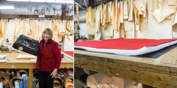
I did research on hot bags, their history and different shapes. I was especially interested, as it happens every time I work with forms, on what elements are essential to make it recognisable as a hot bag. Looking at what could be done, I saw that the main approach would be to get a hot bag and add it a texture or pattern, like a ‘skin’ that could vary. I didn’t want to do that. I decided to change the shape itself, I just found it more interesting creatively.
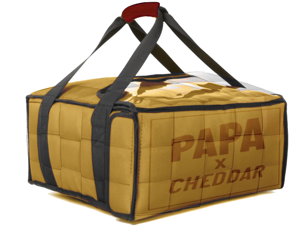
The design had to incorporate cheddar, we were encouraged to think about texture, color etc. Our first drafts were genuinely out there and would be very interesting on a digital form, thinking of melted cheese. Also one of our main concepts was to make the hot bag, excluding straps, a morphing texture of cheese with holes. Until we realised that was gouda and not cheddar.
Seeing how that approach wasn’t working, I did research on Gen Z and its aesthetics, how that could contribute on the design. One of my teammates showed me a music video where yellow post-it notes were used to make a room feel like it’s melting. I was very interested on that ‘analog’ approach. One of my coursmates, Aaron, has a big pair of techwear trousers with a lot of straps that reminded me of melted cheese. With that I started to research what I call ‘the way too many straps trend’, very connected with techwear, where you add seemingly random straps to a garment just for the sake of making it look cool. I love it and Gen Z loves it.

I made my model in blender, using references for the actual shape and adding straps so that they don’t intrude with the use of the hot bag. I decided to make a decorative ‘rig’ with a clasp (so it can be taken off and put on easily) to amplify the amount of straps. I used the colorsstatedon the brief for the design,along with making a metallic gradient for the buckles and clasps. For the scene I decided to recreate the set they used last year, to give it the right context. I decided to go for a 360 view. One of the designs had the logo engraved on a buckle and the other one was plain.

Moving on to my group, me, Ryun and Caelan got put together. Caelan likes drawing but has no software knowledge, Ryun knows a fair bit of Adobe but had never tried blender. Since we had a week to put this together (realistically three days), we decided that with our own methods we would have three designs. Ryun’s and mine were 3D whilst Caelan opted to ad a pattern to an already existing mockup, so 2D.

Caelan wasn’t able to present to the class, so me and Ryun’s design were held under scrutiny. We were criticised on not making a cohesive collection, since the three of them didn’t look like they belonged together. Although this criticism is perfectly valid, and we should have thought about that,the original brief doesn’t mention this as a necessity. My design received very good feedback from students and lecturer’s, as did Ryun’s.
When we got the final decision of the client, we came second, after Liza, Markus and Aaron (although no one won any money, they decided to go for a more conventional approach). My designed received especially good feedback.
Overall, this proved me once again I can develop a good design in a short time span that ticks all the boxes, and more importantly, something that I like. We could have made the project more cohesive but taking into accound the time crunch, it wasn’t a priority.
Thanks for reading.
