Brief given on 17/03/22, finished on 14/04/22. This project was given by the creative agency JDO as a live brief, where we had to ideate a beauty brand ‘with a purpose’. With this saying to identify a social issue and contributing to fixing it with a beauty brand. Change the world!
I rarely have an ethical issue with a brief, but this was one of them. Capitalising on social movements, selling the idea of rebelliousness by consuming a pruduct, is extremely commonplace and wrong. A company can help by not worsening the problem with an ethical production that avoids exploitation of any kind. Commodificating revolution is a practice of détornement to give the consumer a false feeling they are doing something to help by buying. I don’t want to be a part of that.
Instead of finding a problem and fixing it by means of creating a brand, I tried to create an extremely transparent ethos for a good idea. Brands like Lush are a good example of what I believe is a good company. I don’t consume many cosmetics, and when I do I want them to feel good, have quality and an ethical production.
I observed products like Hello Fresh, serivces that, although subscription-based, provide quality and locally-sourced ingredients to encourage a homemade production. They give simple and quick recipes anyone can follow with outstanding results. This brought to my mind homemade cosmetics, a common hobby but something not widespread whatsoever. This is because, even though basic cosmetics (moisturiser, lip balm etc.) are extremely easy and cheap to produce, with few ingredients required, these usually have to be purchased online in bulk. This discourages many people to try homemade production.
My idea was to create a quality brand, with a unique visual identity, that provides kits to make basic cosmetics. With 100% quality, locally sourced and vegetarian ingredients to ensure the best outcome possible. All recepies are less than 15 minutes in length, without requirement of specialised equipment. All kits also include a reusable tin can to store the finished product. All the products are to be sold at standard price to ensure availability to all consumers. Unlike Hello Fresh, this does not follow a subscription-based service, since i believe it encourages over-consumption and can deter customers, it would be sold in regular cosmetics stores and online.
Aside from the logistics I just discussed, I believe that the visual identity is the most important part of the project. We really do shop with our eyes, and specially in the beauty industry, where most brands look the same, a distinctive product is required for a new brand. I wanted something that could be attractive for a wide demographic, although the target demographic is a younger audience. I wanted no gender bias; sadly most beauty products are aimed at women, and everyone deserves to feel beautiful. Male-oriented beauty products, on the other hand, look boring and unappealing; almost exclusively using metallic textures.

I decided to use pastel colors with heavy contrast, this was challenging for me since I don’t usually work with colour, but it was very rewarding getting it right. For the illustrations, I played, once again, conway’s Game of Life, inserting this shape and shoosing different pieces that looked appealing to me. Quickly I realised that endless patterns could be created with the results, patterns that looked very similar to Spanish Mozárabe tiles. To avoid a visual identity solely centered on spanish art, i decided to round the corners of the illustration, creating chain-like shapes.
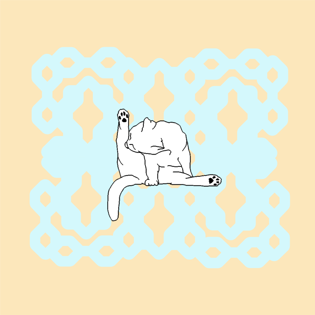

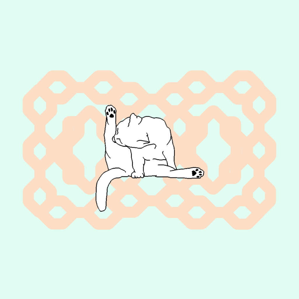
For the logo I decided to use a cat grooming itself. It’s a very recognisable image, as well as very cute, that illustrates perfectly the ethos of the company. I made this illustration on MS paint. In terms of typography I used fonts I found in open-source Velvetyne Type Foundry.

Since I was making this project three days before the final deadline, I didn’t have much time to make mockups. I just made the illusion of a box in illustrator. I made an unique design for each product (lip balm, moisturiser and face scrub) as well as a color scheme for each fragrance (vanilla, lavender and coconut).
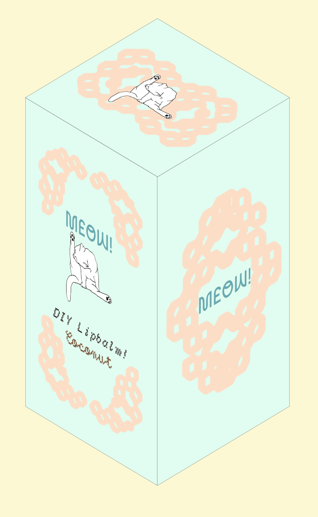
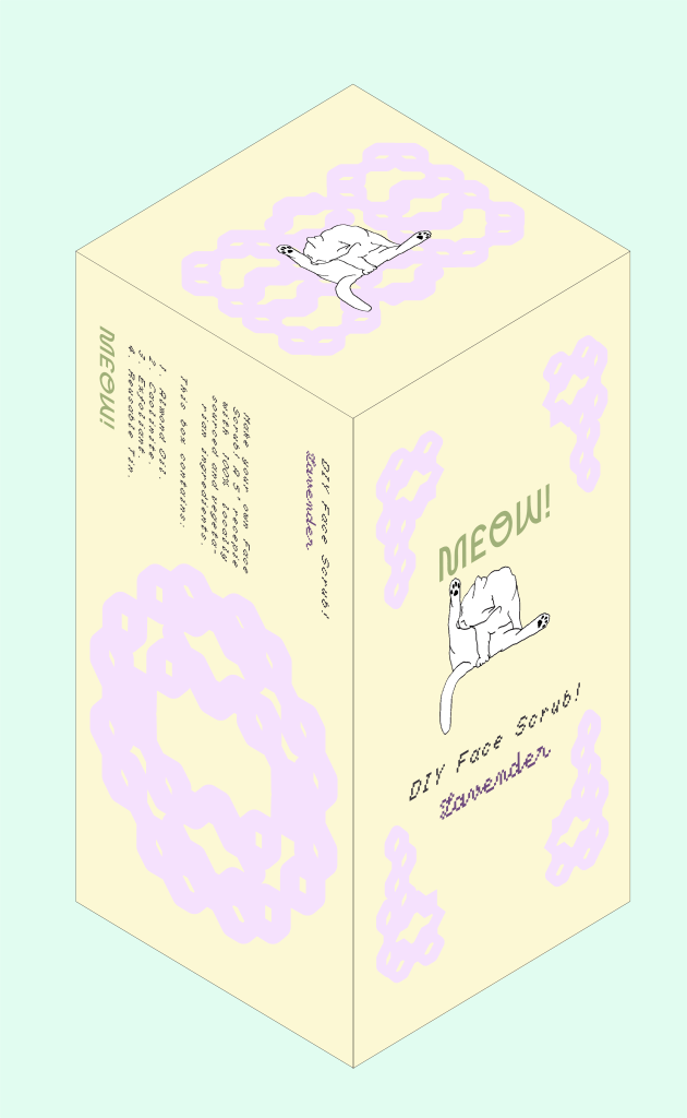
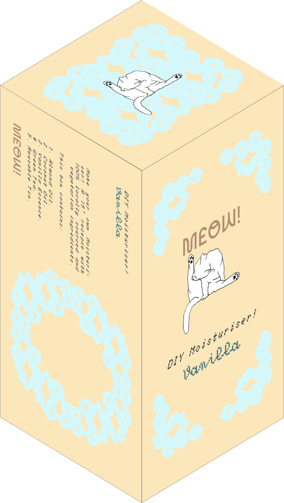
The result was much better than I expected. I genuinely enjoy the packaging and if I saw this in Boots, I would give it a shot. I wish I would have organised myself better to create better mockups, but I don’t regret any design choices. The product is solid, viable, affordable and cute. What else could I ask for?
Thank you for reading.
